Assisted living website design is more than an attractive homepage; it’s about creating a caregiver-focused website that builds trust, clearly explains care options, and guides families to schedule tours or conversations. It’s a trust-building, lead-generating system that helps families feel confident enough to take the next step.
In 2026, most prospects start with online research, typically an adult child or caregiver who searches, compares communities, and seeks clear answers quickly.
That means your website has to do two things at once: provide emotional reassurance and make it easy to find the practical details that drive tour requests.
This guide breaks down the must-have features, common mistakes to avoid, and real-world assisted living website design examples—so you can build a site that ranks, converts, and supports families when they need it most.
Ready to turn your website into a predictable source of tours and qualified leads? Tell us about your project.
Why assisted living website design matters more than ever
Assisted living website design plays a direct role in how families perceive your community—and whether they ever contact you.
Today’s decision-makers are navigating emotional stress, time pressure, and an overwhelming number of options.
Your website must meet those realities while also supporting modern search behavior, mobile usage, and AI-driven discovery.
First impressions for families and caregivers
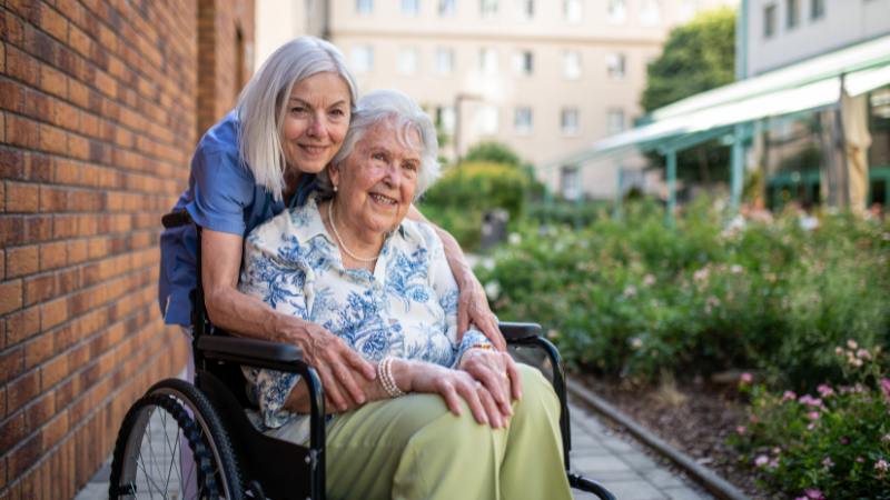
For most families, your website is the emotional front door to your assisted living community.
It’s the first place caregivers go when they’re anxious, unsure, and trying to determine whether a community feels safe and trustworthy for someone they love.
Within seconds, visitors are subconsciously asking:
- Does this place feel warm and welcoming?
- Can I quickly understand the level of care offered?
- Do I trust what I’m seeing?
Clean layouts, calming visuals, readable typography, and clear navigation help reduce anxiety and signal professionalism.
In contrast, cluttered pages, outdated visuals, or confusing menus increase friction and cause families to leave before they ever learn what makes your community special.
Building trust in assisted living decisions
Trust is the single most important outcome of effective assisted living website design.
Families are not just comparing amenities—they’re evaluating credibility, transparency, and integrity.
Strong trust signals include:
- Authentic photography of real residents and staff
- Clear explanations of care services and daily life
- Testimonials, reviews, and third-party recognition
- Easy access to contact information and next steps
Credibility matters more than branding alone. A polished logo or clever headline won’t compensate for vague language or missing information.
Assisted living websites that clearly show who they are, how they care for residents, and what families can expect are far more likely to earn inquiries and tour requests.
Website design as a lead-generation system
Your website doesn’t operate in isolation—it reinforces every referral, recommendation, and word-of-mouth mention your community receives.
When a family hears about you from a doctor, friend, or social worker, the next step is almost always a search.
In 2026, that search experience happens across:
- Mobile devices
- Local search results
- AI-generated summaries and answers
An effective assisted living website design supports all of these touchpoints. It loads quickly on mobile, answers common caregiver questions clearly, and presents information in a way that search engines and AI tools can easily understand.
Must-have features for effective assisted living website design
The most effective assisted living website design balances clarity, trust, and conversion.
Below is a practical, 2026-ready checklist to evaluate or improve your assisted living website.
1. Mobile-first, fast-loading design (Core Web Vitals)
Assisted living website design must start with mobile.
Caregivers often research on their phones—between appointments, at work, or late at night—so your site needs to load quickly and function flawlessly on smaller screens.
Fast-loading pages improve:
- User experience
- Search rankings
- Conversion rates
Optimizing for Core Web Vitals (page speed, visual stability, and interactivity) ensures your website doesn’t lose visitors before they even begin reading.
2. Simple, caregiver-focused navigation
Most visitors arrive with a specific goal: understand care options, evaluate fit, and contact your community. Your navigation should reflect those priorities.
Effective assisted living websites:
- Use plain, descriptive menu labels
- Limit the number of top-level options
- Make care types, amenities, and contact paths easy to find
When navigation is intuitive, families stay longer and explore more pages—both strong signals for search engines and AI-driven results.
3. High-quality photography and virtual tours
Visuals do much of the emotional work in assisted living website design. Families want to see where their loved one might live, socialize, and receive care.
High-performing sites include:
- Professional, well-lit photography
- Real residents and staff (not stock images)
- Virtual tours or video walkthroughs
These elements help visitors picture daily life in your community and reduce uncertainty before an in-person visit.
4. Accessible design for all users
Accessibility is no longer optional—it’s a core component of modern assisted living website design.
Best practices include:
- Large, readable fonts
- Strong color contrast
- Clear headings and spacing
- Keyboard-friendly navigation
Designing with accessibility in mind improves usability for older adults and caregivers while also supporting compliance and broader search visibility.
5. Clear, non-pushy calls to action
Your website should guide visitors toward action without creating pressure. Clear calls to action (CTAs) help families know what to do next when they’re ready.
Effective CTAs include:
- “Schedule a tour”
- “Request information”
- “Talk with our team”
Placed thoughtfully throughout the site, CTAs turn interest into inquiries without disrupting the research process.
Location and community pages for local SEO
Assisted living searches are highly local. Families often search by city, ZIP code, or “near me,” making location pages essential.
Strong assisted living website design includes:
- Individual pages for each community
- Clear address, phone number, and service details
- Localized content that answers area-specific questions
These pages improve local search rankings and help families quickly find nearby options.
Trust signals that reinforce credibility
Trust is built through evidence. Assisted living websites should clearly display signals that reinforce reliability and quality.
Examples include:
- Resident or family testimonials
- Online reviews
- Awards, certifications, or affiliations
- Years of service or care credentials
These elements reassure visitors that your community is reputable and transparent.
Forms and contact paths optimized for lead capture
Finally, your website must make it easy to reach you. Complicated forms or hidden contact information create unnecessary friction.
Effective assisted living website design features:
- Short, simple forms
- Multiple contact options (phone, form, scheduling)
- Clear confirmation of next steps
When contact paths are easy to use, more visitors turn into qualified leads.
Quick checklist for assisted living websites
- Mobile-friendly and fast-loading
- Clear navigation for caregivers
- Professional photography and virtual tours
- Accessible, easy-to-read design
- Gentle but visible CTAs
- Optimized location pages
- Prominent trust signals
- Simple, conversion-friendly forms
This checklist forms the foundation of an assisted living website design that performs well in search, supports families emotionally, and drives consistent inquiries.
What effective assisted living websites do well
High-performing assisted living websites balance emotional reassurance with practical clarity—helping families feel confident while making next steps easy.
Effective sites consistently:
- Prioritize mobile performance, ensuring fast load times and usability on any device
- Guide caregivers with simple navigation, clear headings, and plain language
- Build trust visually, using authentic photography and transparent service explanations
- Support accessibility, making content easy to read, scan, and interact with
- Encourage action gently, with clear, non-pushy calls to action
Key takeaway: The best assisted living website design reduces anxiety, answers questions quickly, and guides families toward tours without pressure.
Assisted living website design mistakes to avoid
Poor assisted living website design increases bounce rates and erodes trust—often before families ever understand what your community offers.
While strong design builds confidence and clarity, common mistakes create friction, confusion, and doubt at a critical decision-making moment.
Avoiding these issues is just as important as implementing best practices.
Dense blocks of text without hierarchy
Caregivers don’t read assisted living websites word for word—they scan for answers.
Long paragraphs without headings, bullets, or spacing overwhelm visitors and make important information hard to find.
Overly complex menus and submenus
Navigation should guide visitors, not challenge them. Overloaded menus, nested dropdowns, or unclear labels force caregivers to work too hard to find basic information.
Common issues include:
- Too many top-level menu items
- Vague labels like “Services” or “Living”
- Important pages are buried multiple clicks deep
Simple, descriptive navigation supports usability, search performance, and conversions.
Outdated or stock photography
Visuals heavily influence how families perceive your community. Outdated photos or obvious stock imagery can signal neglect, inauthenticity, or misrepresentation.
Authentic imagery helps families imagine daily life in your community.
Auto-play video or audio
Unexpected sound or motion can be jarring—especially for older users or caregivers researching in quiet environments.
If you include video, let users choose when to play it. Respectful design keeps visitors engaged rather than startled.
Intrusive pop-ups or surveys
Pop-ups that appear too quickly or block content interrupt the research process and frustrate visitors. While lead capture is important, timing and context matter.
In many cases, well-placed CTAs outperform intrusive interruptions.
Vague CTAs and non-descriptive links
Calls to action should clearly state what will happen next. Generic phrases like “Click here” or “Learn more” create uncertainty and reduce engagement.
Strong assisted living website design uses:
- Descriptive CTAs such as “Schedule a tour” or “View floor plans”
- Clear link language that sets expectations
- Consistent action paths across the site
Avoiding these common mistakes helps ensure your assisted living website supports trust, usability, and conversion, rather than quietly pushing families away.
Why poor website design costs assisted living communities leads
When assisted living websites are confusing, cluttered, or outdated, families leave before trust can form.
Poor design often leads to:
- Higher bounce rates, especially from mobile users
- Lower credibility, caused by vague messaging or outdated visuals
- Missed inquiries, due to unclear or hard-to-find contact paths
- Frustrated caregivers, who can’t quickly find answers
Key takeaway: Avoidable design mistakes don’t just hurt usability—they quietly reduce inquiries and tours at the most critical decision stage.
Assisted living website design examples (what works and why)
The strongest assisted living websites align design choices with operator size, audience needs, and business goals.
The examples below highlight how different assisted living providers—from national brands to boutique communities—use design to build trust, improve usability, and support caregiver decision-making.
Each example focuses on why the design works, not just how it looks.
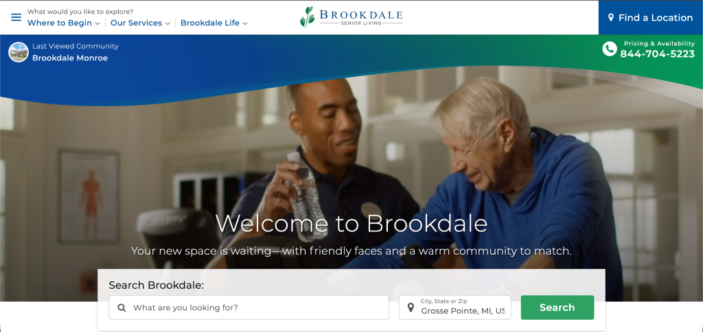
Brookdale Senior Living — enterprise-scale assisted living website design
As one of the largest assisted living providers in the U.S., Brookdale’s website demonstrates how enterprise-scale organizations can still deliver a usable, trustworthy experience.
The site prioritizes wayfinding, making it easy for visitors to search by location, explore care options, and understand what to expect at a community level.
Key strengths include:
- Consistent navigation
- Prominent trust signals
- Predictable structure (that works across hundreds of locations)
For large assisted living operators, Brookdale shows that clarity and familiarity are essential to maintaining usability at scale.
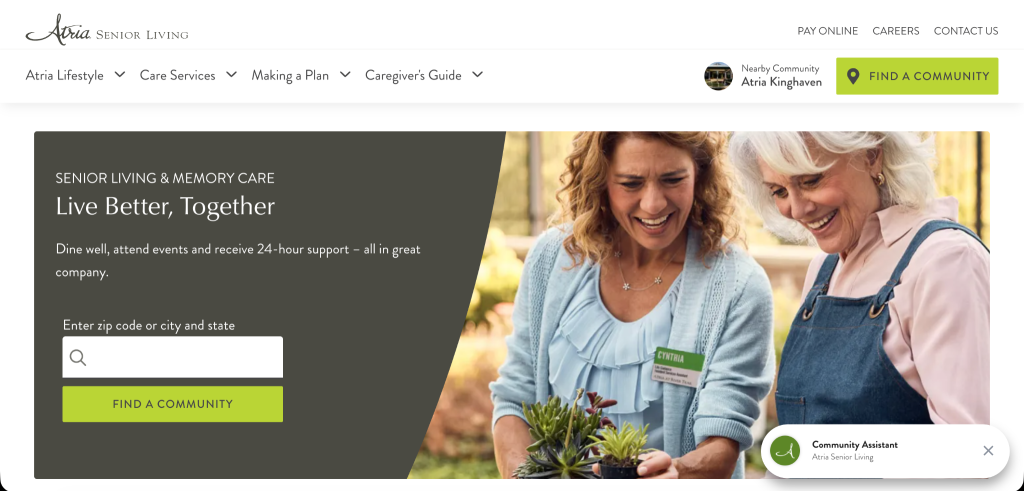
Atria Senior Living — clarity-first assisted living website design
Atria’s website is a strong example of clarity-first assisted living website design. Instead of relying on complex layouts or heavy visual effects, the site focuses on clean structure and intuitive navigation.
Visitors can quickly identify care types, explore communities, and move toward next steps without confusion.
This approach reinforces an important principle: simple navigation and clear information architecture often outperform over-designed interfaces—especially for caregivers under time pressure.
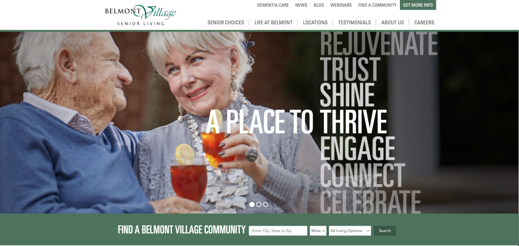
Belmont Village — content-forward assisted living website design
Belmont Village stands out for its emphasis on education and long-form content.
Beyond basic community information, the website offers articles, resources, and deeper explanations that support families throughout the research process.
This content-forward approach builds credibility and positions the brand as a knowledgeable partner, not just a service provider.
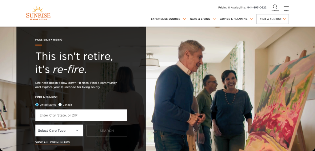
Sunrise Senior Living — task-based assisted living website navigation
Sunrise Senior Living’s website is designed around utility and task completion.
Navigation paths help visitors quickly find care options, locations, and employment information without unnecessary friction.
This task-based structure benefits caregivers who arrive with a specific goal—such as finding assisted living near a particular city or understanding levels of care.
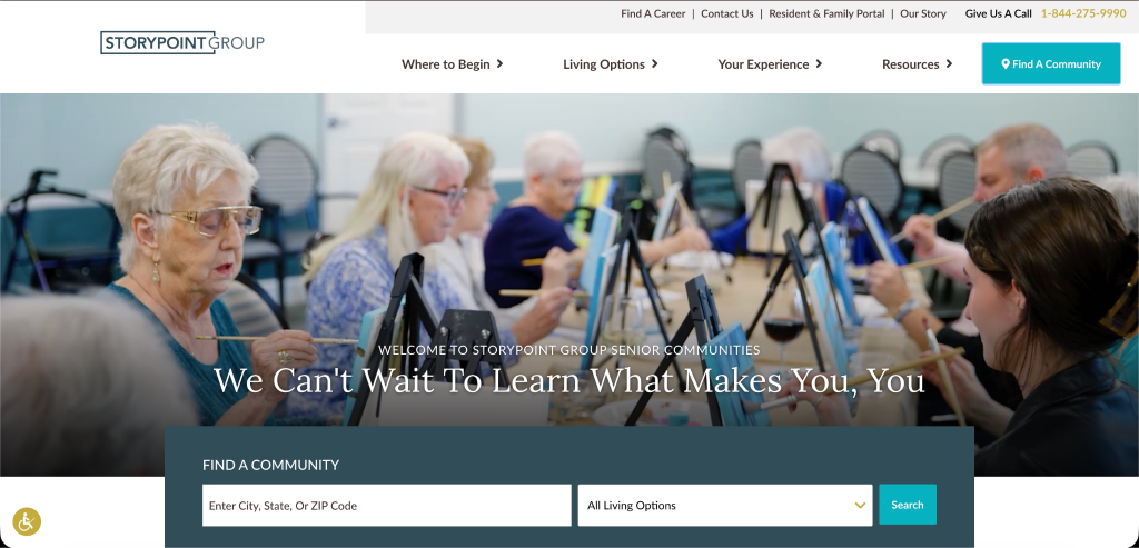
StoryPoint — regional assisted living operator website design
StoryPoint offers a strong example of assisted living website design for regional, multi-location operators.
The site balances operational clarity with a warm, welcoming tone—avoiding the overly corporate feel common in larger national brands.
Features like caregiver-intent pathways, clear CTAs, and consistent location pages make it easy for families to move from research to inquiry.
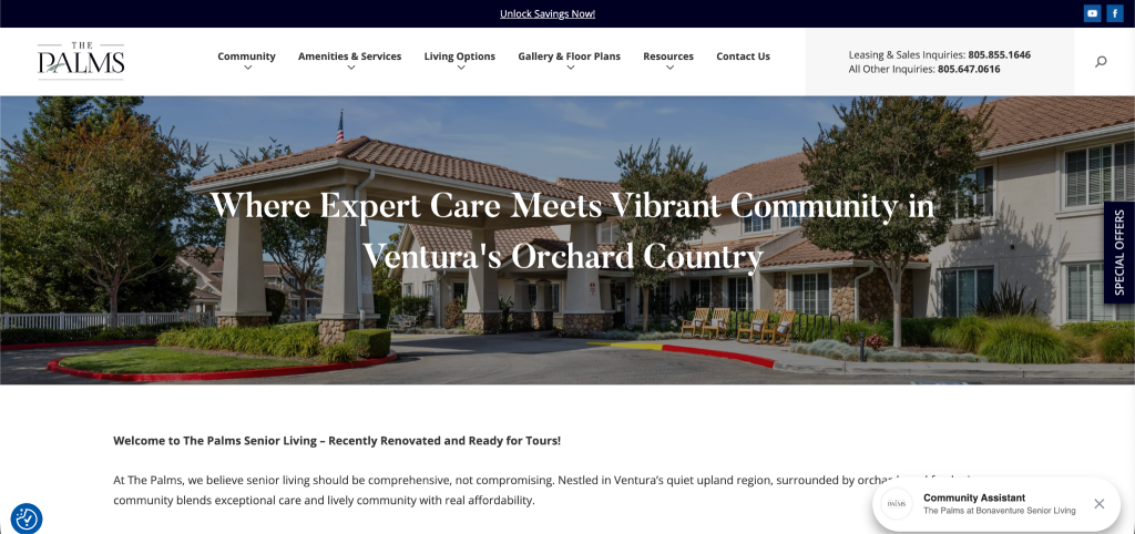
The Palms at Bonaventure Senior Living — boutique-style assisted living website design
As a community-focused assisted living website designed to deliver a boutique experience, The Palms at Bonaventure uses design to emphasize comfort, connection, and community life.
The website leans into emotional storytelling through imagery, language, and simplified navigation.
Rather than overwhelming visitors with options, the site creates a calm, inviting experience that mirrors the environment families are seeking for their loved ones.
How assisted living website design supports marketing and occupancy goals
Assisted living website design directly influences how well your marketing performs and how consistently your community fills available units.
A well-designed website connects marketing channels, qualifies leads, and helps turn interest into scheduled tours.
Your website is the hub for SEO, PPC, and referrals
Every marketing channel eventually points back to your website. Whether a family finds you through organic search, paid ads, or a personal referral, your site becomes the place where decisions are reinforced.
Effective assisted living website design supports:
- SEO by organizing content clearly, using descriptive headings, and answering common caregiver questions
- PPC campaigns by providing fast-loading pages and focused landing experiences
- Referrals by validating recommendations that families receive from doctors, friends, or advisors
When your website is clear, trustworthy, and easy to navigate, it amplifies the impact of every marketing dollar you spend.
Design’s impact on lead quality and tour requests
Strong assisted living website design:
- Sets accurate expectations about care, pricing, and lifestyle
- Filters out mismatched inquiries through clear messaging
- Guides serious prospects toward scheduling a tour or conversation
When visitors can easily understand who your community is for—and who it isn’t—you receive fewer low-intent inquiries and more meaningful conversations with families who are closer to making a decision.
Why design and marketing must work together
Design and marketing are most effective when they operate as a single system.
Marketing brings visitors in, but website design determines whether those visitors stay, engage, and convert.
When design and marketing are aligned:
- Messaging stays consistent across ads, search results, and web pages
- Calls to action feel natural instead of forced
- Data from forms and conversions can be used to improve campaigns
In 2026, assisted living communities that treat website design as a core marketing asset—not an afterthought—are better positioned to generate steady inquiries, improve tour rates, and maintain healthy occupancy levels.
How strong website design drives occupancy
Assisted living website design plays a direct role in turning marketing traffic into qualified tours and move-ins.
When design and marketing work together, your website:
- Reinforces referrals and recommendations, validating outside trust signals
- Improves lead quality by setting clear expectations early
- Supports SEO and paid campaigns, with fast, focused landing experiences
- Converts interest into action, guiding families toward tours and conversations
Key takeaway: A well-designed assisted living website doesn’t just attract traffic—it helps fill units by converting the right families at the right time.
When it’s time to redesign your assisted living website
Assisted living website design should evolve alongside caregiver expectations, search behavior, and marketing strategy.
Signs your assisted living website is outdated
Some issues are obvious, while others surface slowly over time.
Common signs it may be time for a redesign include:
- The site isn’t mobile-friendly or loads slowly
- Navigation feels cluttered or confusing
- Content is hard to scan or hasn’t been updated in years
- Photography looks dated or overly generic
- Calls to action are inconsistent or hard to find
If your website feels confusing or unclear to you, it likely feels even worse to prospective families.
Common symptoms: low conversions and high bounce rates
An outdated assisted living website design often shows up in performance data.
If you notice fewer tour requests or form submissions, higher bounce rates from mobile users, or visitors spending very little time on your key pages, your website experience likely isn’t strong enough to drive action.
The risks of delaying a redesign
As competitors improve their online presence, an outdated site can make your community appear less trustworthy, less modern, or less responsive to residents’ needs.
Delaying a redesign can lead to:
- Lost referrals that aren’t reinforced online
- Higher marketing costs to compensate for poor conversion
- Fewer qualified leads are entering your sales pipeline
- Missed opportunities in local search and AI-driven results
For many assisted living communities, redesigning the website isn’t about starting over—it’s about aligning design, messaging, and marketing into a system that consistently supports occupancy goals.
This is where experienced guidance and a strategy-first approach can make the difference.
Assisted living website design that drives trust, tours, and occupancy
As search behavior continues to evolve—across mobile, local results, and AI-generated summaries—assisted living communities that treat their website as a core marketing asset, not a static brochure, are better positioned to generate qualified leads and increase tour requests.
If you’re ready to turn your assisted living website into a trust-building, lead-generating system, Kaleidico helps senior living communities align website design and digital marketing around measurable results.
FAQs: Assisted living website design
Assisted living website design is the process of creating a website specifically for assisted living communities that balances emotional trust-building with clear information and lead generation.
It focuses on caregiver usability, accessibility, mobile performance, and conversion paths that encourage families to schedule tours or request information.
Assisted living website design directly impacts occupancy, as most families research communities online before contacting them.
A clear, trustworthy website helps convert search traffic, referrals, and paid ad clicks into qualified leads and tour requests, while a poorly designed site increases bounce rates and missed opportunities.
An effective assisted living website design should include mobile-first performance, simple navigation, professional photography, accessible fonts and contrast, clear calls to action, location pages for local SEO, trust signals like reviews, and easy-to-use contact forms.
Assisted living website design supports SEO by making content easy for search engines and AI tools to understand.
Clear headings, fast load times, mobile optimization, and well-structured location pages help communities rank higher in local search results and appear in AI-generated summaries.
Most assisted living websites should be evaluated every two to three years. A redesign may be needed sooner if the site isn’t mobile-friendly, loads slowly, has low conversion rates, or no longer reflects current caregiver expectations or search behavior.