
Alright, let’s cut to the chase. You’re not here to just “ooh” and “ahh” at pretty websites. You’re here because your business and website need a serious boost, and you need inspiration from some of the top Michigan website designs.
You need a website that not only looks fantastic but also rakes in the leads and makes your revenue graph shoot upwards.
In this article, we’ll look at a list of businesses right here in Michigan that have their online act together. These guys aren’t just showcasing fancy digital storefronts—they are converting clicks into customers, day in and day out.
Take notes, because these websites’ designs might be your golden ticket to hitting those sales targets and maybe even surpassing them. Let’s get into it!
Skip ahead: Schedule a free discovery call with our expert marketing team.
How we picked the best Michigan website designs
Your first impression with potential clients usually happens online during a Google search.
Either they’ll stumble upon your website from reading a blog, or click on your website in a Google Maps search.
Or perhaps they were referred to your company by a friend. In any case, let’s hope your website’s design and contents can retain a visitor on your website long enough to fill out a contact form.
While choosing the best website designs in Michigan, we used the following criteria to ensure we only showcased the best websites.
User experience and navigation
A great website should guide its visitors intuitively. The navigation structure should be coherent, making it effortless for users to find what they are looking for, whether it’s a law firm’s list of services or a mortgage calculator.
Mobile responsiveness
Did you know half of all website traffic is from mobile phones? That’s why Google has a “mobile-first” policy now where they recommend mobile-friendly websites first in their search results.
Aesthetic appeal and creativity
The website’s visual design should be pleasing and align with the brand’s identity. It should effectively use color, images, and typography to create a cohesive and attractive look.
In other words, avoid design mistakes that will make your website ugly and cause your readers to question if your business has gone out of business.
Also, adding interactive tools, like mortgage calculators and charts, can really set your website apart, giving you a competitive edge over other businesses in your area online.
Content (blog) quality
Adding “how-to” blogs to your website can really rake in that free, organic traffic from Google searches as part of your content marketing strategy.
Your website’s blog articles and written content need to be well-written, free of any typos, and should provide educational and actionable steps for your readers to take.
It’s through your blog posts that you can establish yourself as an authority and convince readers that your company is worth reaching out to (by conveniently placing calls to action and contact forms throughout the website).
Additionally, writing about local cities or events in Michigan can improve your website’s traffic from local users, whether you’re writing about local businesses or local events that have recently happened to take advantage of search traffic about these topics.
Load speed and search engine optimization (SEO)
Slow websites are a quick turn-off for most users.
If a website fails to load within 2-3 seconds, most visitors will “bounce off” the website before ever clicking on anything.
Websites need to be optimized for search engines, helping companies rank high up in local Google searches.
The 28 best website designs for Michigan businesses
Michigan is home to nearly 1 million small businesses.
About 71% of these companies have an online presence and a website.
The websites spotlighted in our following list are from sectors such as finance, law, senior living communities, financial technology, and other noteworthy businesses such as museums, universities, and even government websites.
You’ll notice these websites aren’t just aesthetically pleasing, they’re also streamlined, user-friendly, and crafted specifically for lead generation.
Let’s dive into our list and discover what makes these Michigan-based websites the gold standard in modern web design.
The 5 best finance and mortgage websites in Michigan
Michigan, particularly Detroit, is a hub for the mortgage industry, housing the headquarters of significant players like Quicken Loans.
When it comes to websites in this sector, you’ll notice the standards are high, blending professionalism with a touch of local, Michigan flair.
The following best finance and mortgage websites exemplify great design and high-quality content that attracts traffic and converts visitors into potential homebuyers.
1. Quicken Loans

This site impresses with a sleek interface that efficiently guides users to the resources and financial solutions they are seeking.
2. Flagstar Bank

Boasting a modern and professional design, it offers users an intuitive navigation system to explore a variety of banking services.
3. United Wholesale Mortgage

This platform features a straightforward and contemporary design, highlighting the company’s innovative approach to the mortgage industry.
4. Ally Financial

Ally’s website is modern, accessible, and on-brand. Simplicity is sometimes the best route to go with your web design.
5. Lake Michigan Credit Union

Notice LMCU’s user-friendly interface and range of financial resources.
We know mortgage—Get 20 years of mortgage lead generation experience with Kaleidico.
The 5 best law firm websites in Michigan
Michigan has a pretty diverse and vibrant market for law firms and attorneys, from small to large firms providing an array of services.
The following law firm websites offer a glimpse into the world of top-notch legal website designs:
1. Miller Canfield

The site presents a clean and elegant design, with an extensive resource library providing value to its users.
2. Bodman

Reflecting sophistication and expertise, Bodman smoothly navigates users through its wide array of legal services and insights.
3. Clark Hill

Emphasizing its extensive range of legal services, Clark Hill offers an organized, minimalist, and professional online experience.
4. Sam Bernstein Law Firm

Notorious in Michigan, Sam Bernstein’s law firm offers a bold design in line with its brand and a strong call-to-action to “1-800-Call Sam.”
5. Fieger Law

Fieger Law’s website features a distinctive and assertive design, echoing the firm’s brand identity.
Attract more qualified case leads to your law firm with our results-driven marketing services.
The 5 best senior living communities websites in Michigan
Michigan is the 10th most populated state in America and it has over 2 million residents over the age of 60, or roughly 25% of the population.
What this means is there’s no shortage of senior citizens and their caregivers looking for senior living options at any given time.
The following senior living websites provide a beacon of hope for families in need of senior healthcare and senior living options:
1. Presbyterian Villages of Michigan

With a welcoming and warm design, the website effectively showcases the communities and services offered to senior citizens.
2. Bickford of Midland Senior Living

Combining aesthetics with functionality, this website vividly portrays the vibrant lifestyle and amenities available in their communities.
3. Sunset Retirement Communities & Services

Offering a tranquil and soothing design, the website provides detailed insights into its services and communities, fostering a sense of trust and reliability.
4. Porter Hills

Porter Hills Village features a well-structured website with a wealth of resources for seniors and their families.
5. Beacon Hill at Eastgate

Beacon Hill offers an elegant design with in-depth information on its community amenities and a peek into the community’s environment.
Fill more rooms with Kaleidico’s proven senior living marketing plan.
The 5 best technology websites in Michigan
Michigan is quickly becoming the tech hub of the Midwest, thanks largely to institutions like the University of Michigan and other top-rated tech schools, such as Lawrence Tech, Michigan State University, Wayne State University, and Michigan Tech.
The following technology companies (unsurprisingly) have great websites that incorporate modern design trends:
1. Duo Security

Duo Security offers a modern, sleek design, integrating a wealth of resources on cybersecurity, reflecting its status as a leader in the industry.
2. May Mobility

This website presents a modern and innovative design, aligning with the company’s revolutionary approach to transportation solutions.
3. Coupa (formerly LLamasoft)

With a clean and professional layout, it offers in-depth insights into its cutting-edge supply chain solutions, establishing itself as a thought leader in the sector.
4. StockX

Prominent e-commerce site StockX is renowned for its user-friendly interface and modern design.
5. OneStream Software
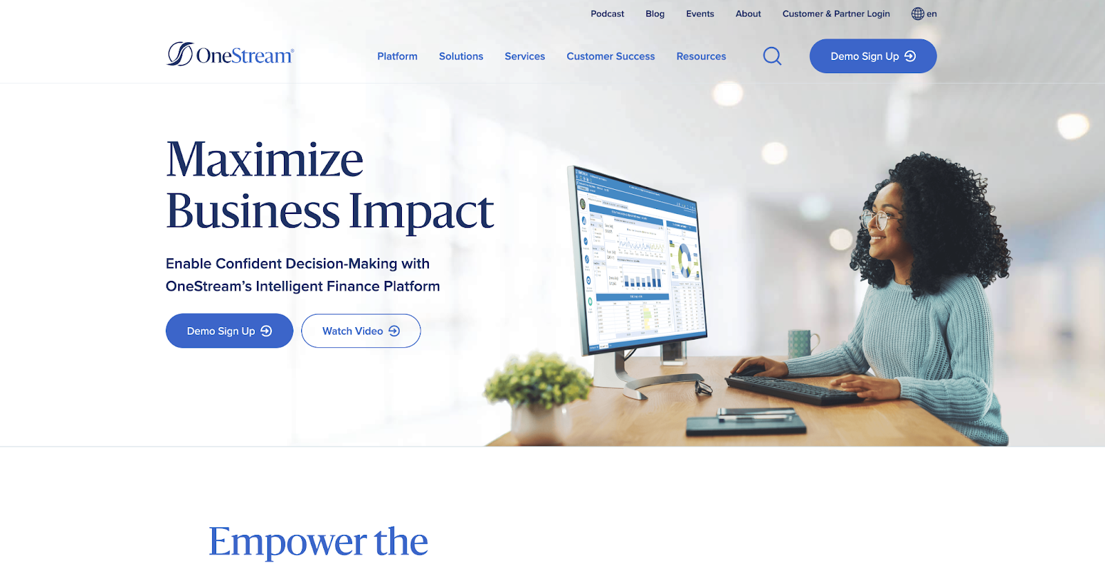
OneStream is simple to the point with direct calls to action on the home page and a range of resources on financial solutions.
13 noteworthy mentions for great Michigan website designs
Outside our main industries of mortgages, senior living, and law firms, Michigan also has an abundance of other institutions and global brands with outstanding websites that are worth mentioning here.
From educational institutions to government websites to Fortune 500 companies, these websites serve as fantastic examples of web design done right:
1. University of Michigan
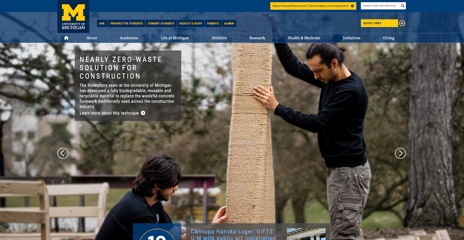
The University of Michigan’s website mirrors its stature, offering a user-centric experience packed with rich resources and vivid insights into campus life.
2. Pure Michigan

Capturing the spirit of Michigan’s unrivaled natural beauty and vibrant cities, the Pure Michigan tourism website invites users on a virtual journey, showcasing the state’s gems through immersive visuals and captivating narratives.
3. Michigan.gov
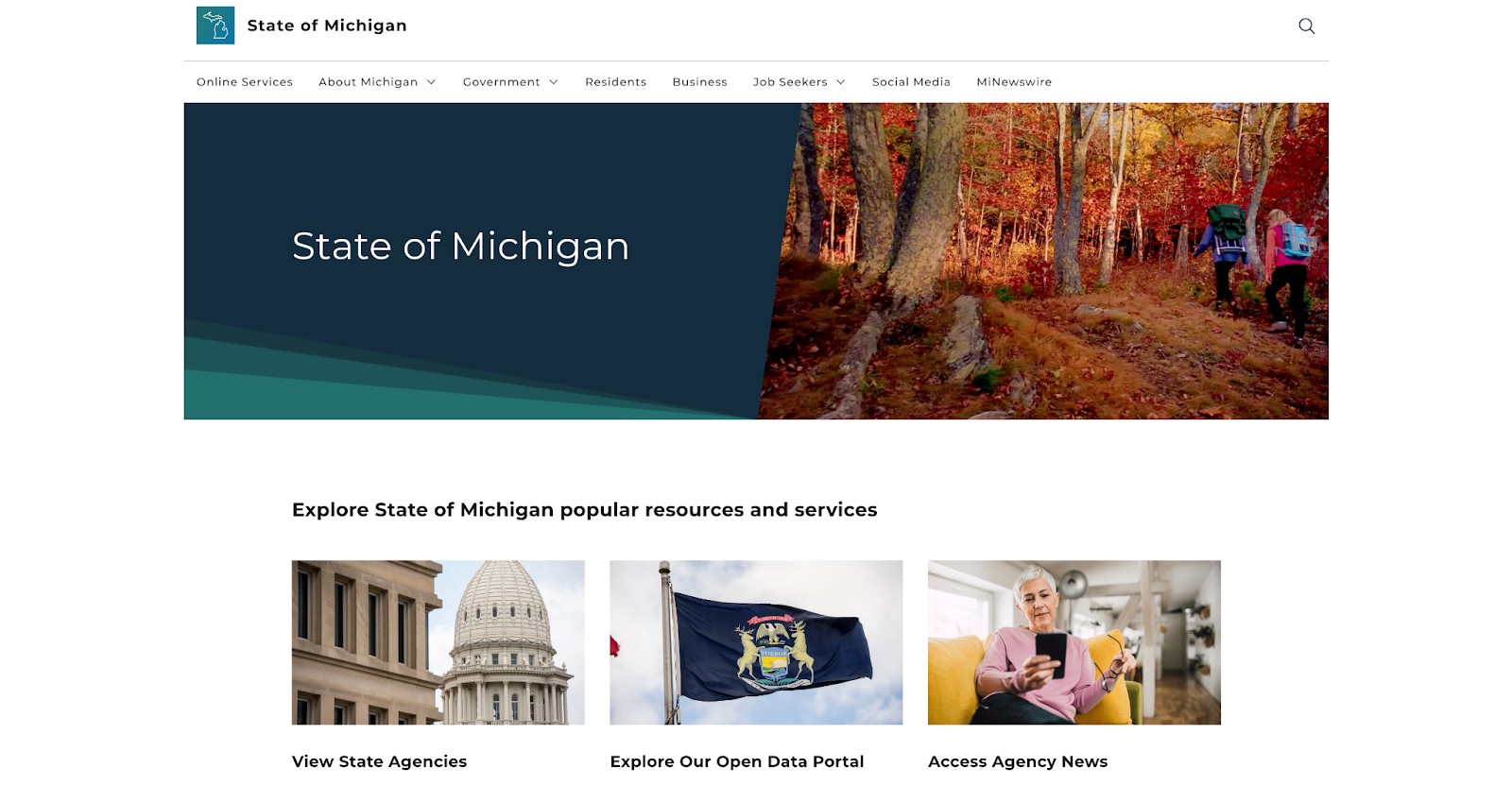
A hub of seamless functionality, Michigan.gov stands as the epitome of a government website done right (a rarity!), offering residents swift access to a wealth of information and online services with just a few clicks.
4. Henry Ford Museum

Much like the innovative spirit it showcases, the Henry Ford Museum’s website is a modern marvel, offering a dynamic portal into the world of ingenuity and inspiration that awaits visitors.
5. Detroit Zoo

An interactive expedition at your fingertips, the Detroit Zoo’s website is a lively portal that brings the wonders of wildlife right to your screen, promising excitement and education for visitors of all ages.
6. Detroit Institute of Arts

A digital canvas that is as captivating as the art it hosts, the Detroit Institute of Arts’ website invites users to explore the rich tapestry of art and culture through a sleek, user-friendly interface that echoes the grandeur of its physical space.
7. Carhartt

With a rugged and authentic design that mirrors its products, the Carhartt website stands as a testament to its legacy, offering a seamless shopping experience infused with the brand’s rich heritage and commitment to quality.
8. La-Z-Boy

Embodying comfort and innovation, the La-Z-Boy website offers a delightful browsing experience, allowing visitors to effortlessly customize and envision their perfect piece of furniture in a space designed for relaxation and luxury.
9. Dow

Reflective of its industry-leading stance, the Dow website serves as a dynamic platform where innovation meets functionality, presenting a treasure trove of information and solutions in a sleek, modern package.
10. Little Caesars

A feast for the eyes, the Little Caesars website grabs you with vibrant visuals and an inviting layout, making pizza ordering a fun, quick, and engaging experience, just like their famous Hot-N-Ready pizzas.
11. Ford Motor Company

The Ford website embodies the spirit of innovation, offering a sleek platform where users can explore the brand’s groundbreaking vehicles through rich media, interactive features, and detailed insights, encapsulating the essence of modern automotive excellence.
12. General Motors

Harnessing the power of innovation, the General Motors website stands as a gateway to the future of mobility, showcasing a range of automotive marvels through a responsive, user-friendly interface that reflects its pioneering spirit.
13. Kellogg’s

Much like the comforting and nourishing products it offers, the Kellogg website offers a warm, inviting space where consumers can explore the brand’s diverse range of offerings, accompanied by a sprinkle of nostalgia and a commitment to nutrition.
Getting your business ready for a website redesign
As you sift through our curated list of the best website designs, jot down the website elements and design choices that resonate with you, and which ones don’t.
Notice the components that these websites choose to feature about their company. Think of the impressions you would want a user visiting your website to have.
This exercise will help you paint a vivid picture of your brand’s potential new website.
Next, you’ll want to choose the right agency to handle your website design and revamp.
Schedule a Discovery Session
Learn how to attract new leads and clients.
Choose Kaleidico: Your trusted partner for website design and marketing in Michigan
Are you looking to spruce up your website and start generating more leads again?
At Kaleidico, we have over 15+ years of experience helping businesses boost their online presence, whether Michigan-based or nationwide and generate more leads to fuel their sales pipelines.
Our team specializes in:
- Lead generation
- Streamlined website design
- Content marketing
- PPC advertising
- Email marketing
- Social media marketing
Ready to take the leap on your new website design?
Image by Mohtashim Mahin from Pixabay
