The mortgage industry won’t return offline anytime soon; quite the contrary — there are more online lenders today than ever. But not all of them have the best mortgage websites.
Today’s prospective homebuyers expect a seamless home loan online experience and will no longer settle for mediocre websites.
Offering your website’s visitors a great digital experience will make all the difference between generating mortgage leads and losing potential clients.
In this article, we’ll cover the top features of all the best mortgage websites so you can copy their approach to start generating exclusive mortgage leads.
Attract more qualified mortgage leads to your business with our results-driven marketing services.
What are the top features of the best mortgage websites?
The best websites offer their readers an intuitive user experience.
You want them to quickly find answers to their mortgage-related questions in hopes that the readers will take the next steps to become a lead.
Keep your mortgage website’s design relatively minimal instead of bombarding readers with pop-up ads and animations. Again, we want readers to quickly find your loan options or apply online and fill out their contact info for more information.
Let’s look at the top features of the best mortgage sites.
About us page
Every company’s website usually includes an About page. Besides being customary, it aims to confirm that you’re a legitimate company.
Not only that, but your About page is also important for SEO purposes — generally, the more pages you talk about being a mortgage company, the more pages Google will index into its search results.
When people search for “mortgage companies,” your company’s website will be a relevant search result.
Progressive forms
Instead of displaying a boring contact form on your website, have a couple of clickable buttons that say “Apply online” or “Refinance a Home.”
Then, when users click these buttons, they’ll be redirected to a progressive form.
Progressive forms are a smarter type of contact form that asks one simple question at a time and remembers your reader’s answers so it doesn’t ask duplicate questions—often the ire of many people filling out forms.
Thank you page
There’s nothing worse than entering your personal information into a website and getting no confirmation that your information was sent through. This can be alarming and anxiety-inducing to your readers.
Instead, create a simple “thank you page” after completing a form submission. It’s a nice gesture and will give your new lead peace of mind.
Blog page
Mortgages are confusing for the average reader. This is why you should invest in writing blogs about each of your loan products and blogging often about them.
When people discover your website for the first time, it’s usually because they stumbled upon your mortgage-related blog while researching mortgages on Google.
The more answers you can put onto the internet (in the form of helpful blogs), the more leads you will attract through Google searches.
Mortgage calculators
Don’t be afraid to add mortgage calculators, even if prices increase. Mortgage calculators are a big draw for websites, and if you don’t include one, your readers will likely look for another mortgage website with one. Once they get their results, they can apply online for preapproval right on that page.
Calls-to-action optimized on every web page
Your readers might be so caught up reading your website’s content that they forget to contact you.
This is why it’s important to add calls to action (CTAs) such as “Calculate Your Payment,” “Apply online,” or “Start mortgage preapproval” to suggest that your reader fill out a contact form or contact you directly.
Simple, intuitive design
The last thing you want to do is distract readers from filling out contact forms. This is why Kaleidico believes in a simple, minimalistic design.
Don’t overwhelm your audience with too many bells and whistles, or they’ll bounce off your site before they can complete their form.
Also, don’t reinvent the wheel when redesigning your website. Keep your logo at the top left and stick to traditional navigation.
Loan officer bio pages
Bio pages for each loan officer on your website can establish trust and rapport with potential homebuyers before you even speak with them.
Bio pages can quickly build confidence in your web visitors about the mortgage process by offering a quick glimpse into the loan officer’s professional background, skills, and personal approach. This will make them more likely to contact you.
Here are the key elements of an effective loan officer bio page:
- A professional headshot
- Biography of their background, qualifications, NMLS number, and experience
- Contact information, including phone number, email, and social media links if appropriate
- Customer testimonials
Clear and engaging content to add to your mortgage website to improve user experience and generate mortgage leads
Your mortgage website isn’t exactly a “set it and forget it” type of situation. You’ll need to continually add new content, such as blog posts, to attract new traffic from Google searches.
However, you should seriously consider adding more interactive features to your website, such as mortgage rate calculators and rate tables, in addition to blogs, since these are the top features homebuyers look for online when researching.
Read through the list below to get inspiration for engaging content and interactive tools you can add to your website to improve lead generation.
Educational resources and guides
Free resources like blogs, ebooks, PDFs, and cheat sheets help prospective homebuyers understand the complicated nature of mortgages.
Generally, the more resources and blogs you can write about each of your loan products, the more leads you will generate because people search Google for mortgage help.
The question you have to ask yourself is: Will people searching online for mortgage help find my website or my competitors’ website?
Remember, the more blogs and resources you can put online, the more likely somebody will stumble upon it in a Google search and go to your website to fill out a form.
Frequently asked questions (FAQs)
A well-structured FAQ section or page is a valuable resource, allowing visitors to find answers quickly and efficiently without too many clicks.
FAQ pages save your visitors’ and your team’s time by reducing repetitive inquiries for the same questions.
By providing quick and easy answers, you’ll generate higher-quality leads because those who reach out to you will be confident and knowledgeable about the loan products they’re interested in. This will lead to more meaningful conversions and a higher chance of a conversion.
Also, sometimes adding a FAQ page to your website can give you a fast track to Google’s first page of search results, where question-based inquiries seem to dominate the first page of search results.
Client reviews and testimonials
In our digital world, trust is incredibly important because we’ve all been scammed and are likely hesitant about messaging companies we may not be familiar with.
Adding client reviews and testimonials to your mortgage website will increase your credibility, leading to higher trust levels and ultimately increasing conversion rates.
If you want to see a website that highlights customer reviews well, look at Homefinity’s website to see how it uses social proof to its advantage.
Live chat and support
When users have questions or need assistance, speaking to a real human is better than talking with an AI-powered chatbot.
With live chat, users can get immediate real-time responses, enhancing their experience on your website.
While AI-powered chatbots are useful, especially after business hours, there’s something special about knowing there’s a real person at the end of the chat.
Studies have shown that 86% of consumers prefer speaking to a real person rather than a chatbot for quick interactions.
Generate high-quality mortgage leads with Kaleidico now.
Embracing new technologies and trends in mortgage websites
Get ready to embrace the new technologies and trends in 2024 for an enhanced user experience (UX) on mortgage websites.
As customer preferences have shifted towards digital interactions, mortgage websites can go the extra mile to generate more leads by delivering a seamless and interactive experience.
Stay ahead of the game by embracing these innovations and providing a user-friendly, accessible experience for all of your mortgage website visitors:
Video content
Did you know that short-form videos, like those found on Instagram Reels, TikTok, and YouTube Shorts, are the fastest-growing trend of 2024?
They’re particularly popular among younger audiences, such as millennials and Generation Z, and they’re insanely addicting, captivating viewers like never before.
Incorporating videos on your mortgage website can significantly impact lead generation and SEO. It increases visitor “dwell time,” the duration they spend on your site, improving conversion rates.
Additionally, uploading videos to social media platforms such as YouTube, Instagram, and TikTok can greatly expand your company’s reach, attracting more people to your website.
Remember, YouTube isn’t just a video-sharing platform — it’s a search engine and a social media platform. When uploading videos, optimize them to include relevant keywords and provide comprehensive descriptions incorporating other keywords.
Using videos in 2024, you can tap into a growing trend to engage your audience and extend your company’s online presence.
AI and chatbots
Mortgage websites are now integrating AI and chatbots to improve the user experience and provide immediate responses to customer inquiries.
These new chat and AI tools can answer your customers’ questions instantly and inform them of important decisions so they feel more confident about contacting a real person at your company.
An excellent example is Rocket Mortgage, whose AI-powered chatbox simplifies the loan inquiry process.
SSL security and trust signals
In the new era of cyber threats, it’s crucial to assure your website’s users of the safety of their data.
If your website isn’t properly secured, you may see suboptimal conversion rates. This is likely because your visitors don’t feel confident enough to submit their contact info to your website.
Make sure your website has an SSL security certificate, and consider displaying these trust signals on your website to improve customer trust and conversion rates:
- Trust badges and seals, such as Norton Secured, McAfee Secure, or BBB Accredited Business
- Clearly state and link to your company’s privacy policy for transparency
- Add customer testimonials and reviews as “social proof” that your company has helped other people
- Clear contact information (physical address, phone number, email address) for additional social proof that your company is legitimate
- Secure hosting
- Professional design, branding, and a website that’s free of typos (because nothing raises flags quicker than misspellings and poor grammar)
Intuitive navigation
Offering intuitive navigation isn’t just about easy-to-find menu bars (although important) but also encompasses an organized content structure, clear labels, and a logical page hierarchy.
Intuitive navigation aims to help your website’s visitors find the information they’re looking for in the least amount of clicks possible.
If you look at the best mortgage websites below as examples, you’ll see that most have these features:
- A clear and concise menu
- Well-defined service categories and loan product pages
- Visually distinctive call-to-action buttons
Mobile responsiveness
When it comes to getting your mortgage website on Google, you better make sure it’s mobile-responsive. Otherwise, it’ll never appear on the first page of the results.
This is because Google now relies on “mobile-first indexing,” which means its crawler bots search for websites’ mobile versions first, not the desktop versions. So, if your website doesn’t have a mobile version, Google will have a more difficult time scanning its content to put into its system.
This new approach acknowledges the importance of mobile-friendly experiences in a world where mobile phone usage is beginning to dominate internet access.
Speed and performance
Your website visitors will expect your website to load quickly, and if it doesn’t, they’ll split equally quickly.
The speed of your website significantly influences the user experience and your search engine ranking, as Google doesn’t like to recommend slow websites to people.
Typically, websites that are slow to load see higher “bounce” rates, which are people who land on your website and leave it within 30 seconds or without clicking on anything (whichever happens first).
Web Accessibility
This is no longer just a “nice” thing to have but is pretty much a requirement for most websites, depending on your country or region.
Web accessibility aims to make your website usable to anyone, even those with disabilities such as blindness, difficulty reading, or color blindness.
Here are some suggestions on how to improve your website’s accessibility:
- Enable keyboard-only navigation to allow visually impaired users to access your website with ease
- Have adequate color contrast between text and background
- Add captions and transcriptions for videos
- Provide alt tags for images, which a computer can read to describe an image
- Offer text resizing options to adjust the text size on the screen
Generate high-quality mortgage leads with Kaleidico now.
Our list of the best mortgage websites
A great website is the first step in our proven mortgage marketing strategy.
Browse through our list of the best mortgage lender websites and see if you can spot the recurring website design trends of years past.
Wells Fargo
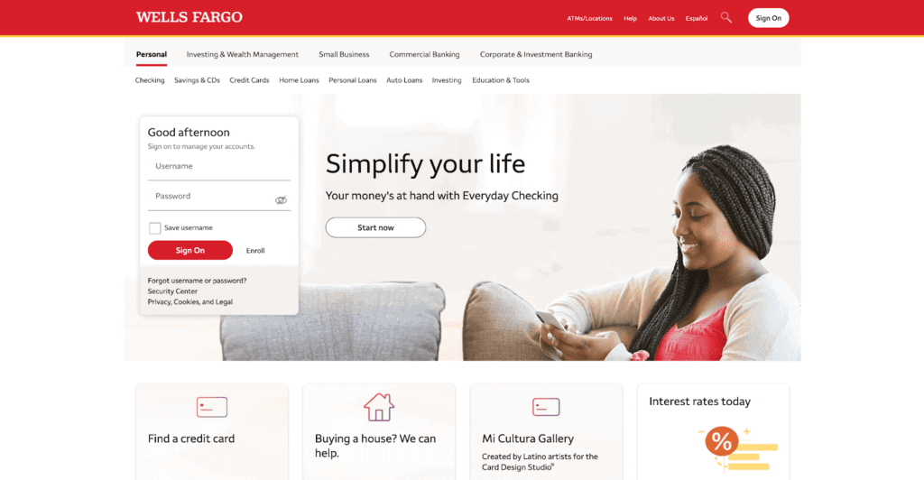
Wells Fargo’s mortgage homepage is modern and user-friendly. It has a section for updated mortgage rates and an educational blog.
We especially like the “Buying a House?” tab near the bottom of the page. When a user clicks on it, it directs the right to a contact page for easy lead conversion.
This is the perfect example of a “lead path” that grabs readers’ attention, gets them to click, and then directs them to fill out a form. This is more effective than just putting a generic form on the side of the page.
New American Funding
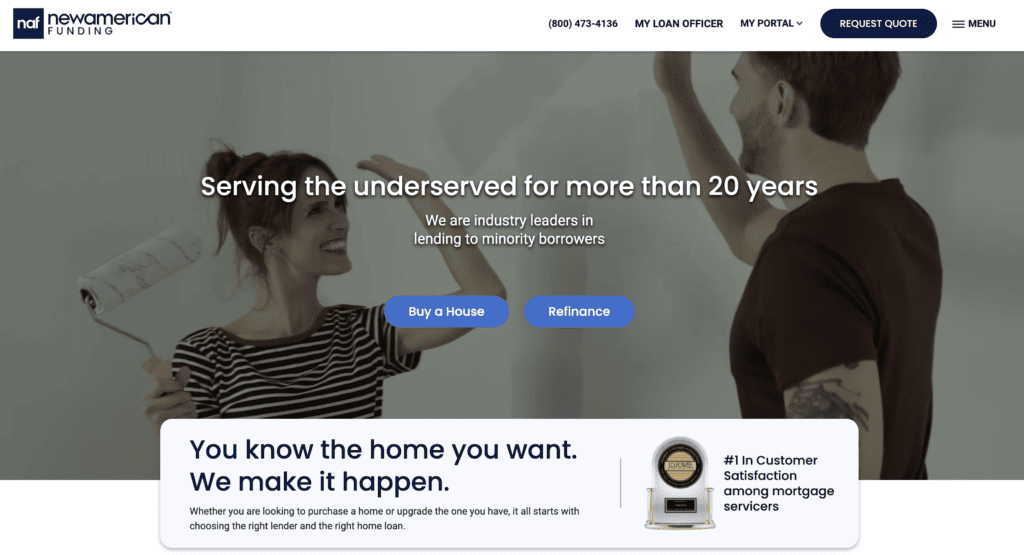
New American Funding has a simple homepage, clearly labeled options for user scenarios, and progressive forms.
You’ll notice the buttons that say “Buy a House” or “Refinance.” These lead paths generate a lot of clicks out of curiosity and are less imposing than a contact form that asks for personal information.
Carrington Mortgage
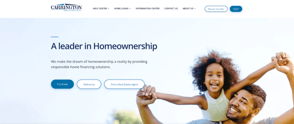
Carrington Mortgage’s homepage is family-oriented, simple, and user-friendly.
Again, this website uses progressive form lead paths as clickable buttons directly in the line of sight.
You’ll also notice a simple mission statement: “A leader in Homeownership.” Adding mission statements ensures your readers will stay on the page longer because it verifies they’re on a website that can help them.
I also love that their website shows a simple comparison chart for each loan product offered, which is important information home buyers are always searching for.
Ally
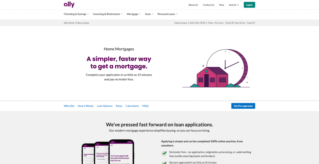
Ally has a minimal, clean design with easy navigation to let borrowers find loan options, mortgage calculators, mortgage rates, and FAQs in one place.
A contact form is at the bottom, and a button to start the pre-approval process is also included.
This homepage truly does offer a “simpler, faster way to get a mortgage” as promised.
Reali
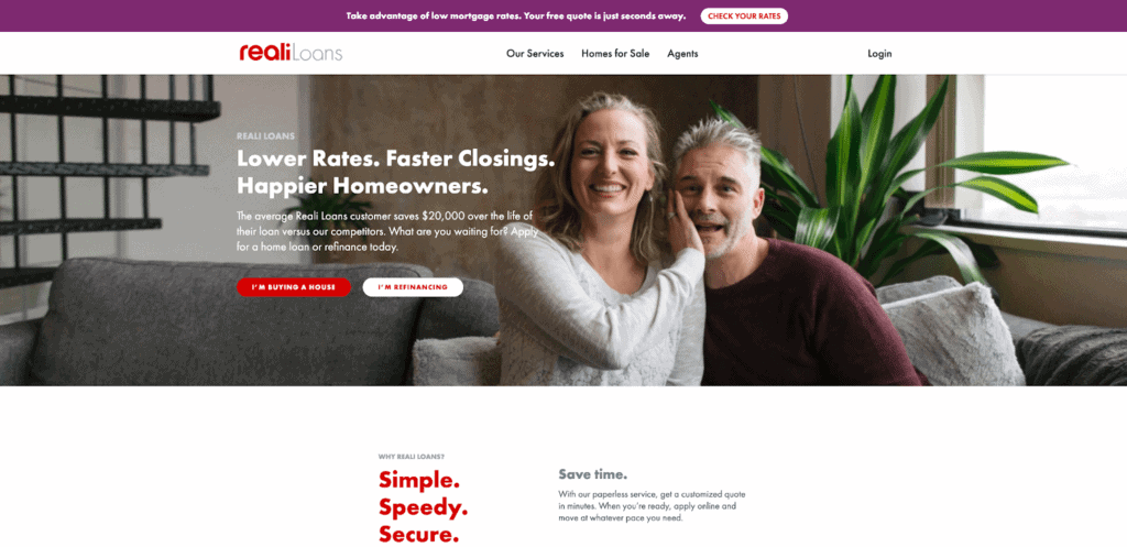
Reali has clear options, minimal design, reviews, and multiple starting points for a user to stay on the site, including an informative blog.
Assist Home Loans
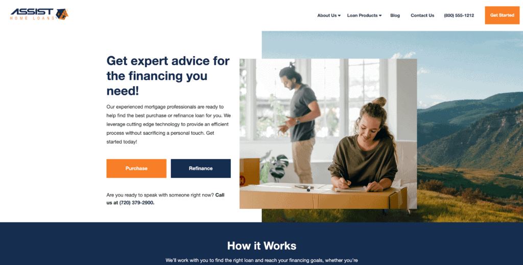
Assist Home Loans also includes a strong mission statement and lead paths in the form of clickable buttons that start the lead generation process.
Compass Mortgage
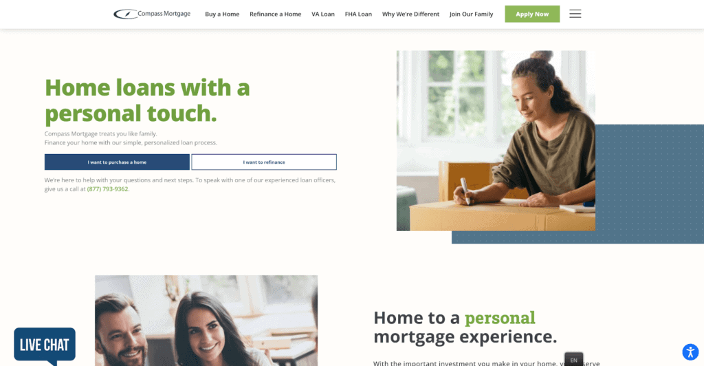
Compass Mortgage’s website follows the same trends as the previous websites:
- A strong mission statement
- Clickable lead path buttons
- Professional stock imagery
- Clean navigation
Rocket Mortgage
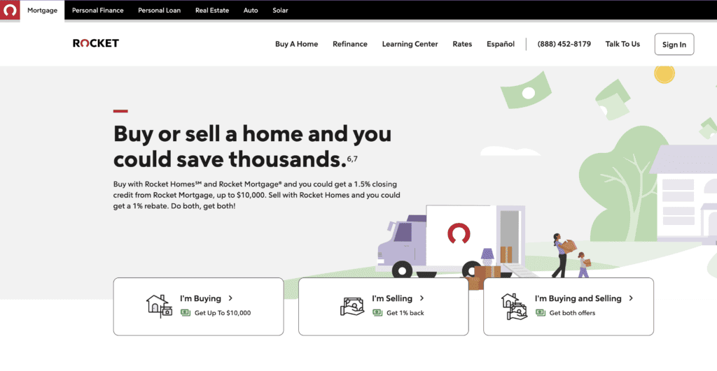
Rocket Mortgage’s website, formerly Quicken Loans, is renowned for its simplicity, speed, and user-friendliness.
It’s designed with prospective homebuyers in mind, focusing on making the confusing mortgage process more straightforward.
Here are some features of their website’s design:
- An intuitive design that uses bold colors, clear CTAs, and a well-organized structure
- Interactive tools such as mortgage calculators and mortgage rate tables to get a quick estimate on mortgage payments
- A mobile-friendly design
- An extensive learning center blog page filled with many articles, guides, and other resources to help first-time homebuyers and home refinancers understand the process.
Bank of America
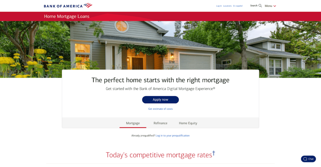
Bank of America’s mortgage website provides a comprehensive, user-friendly experience for those looking for a home loan.
Here’s what I like about their website:
- Easy navigation with clear categories
- Mortgage calculators and other interactive tools
- An emphasis on building an inclusive website with great web accessibility options
- Detail information on their various loan products
LoanDepot
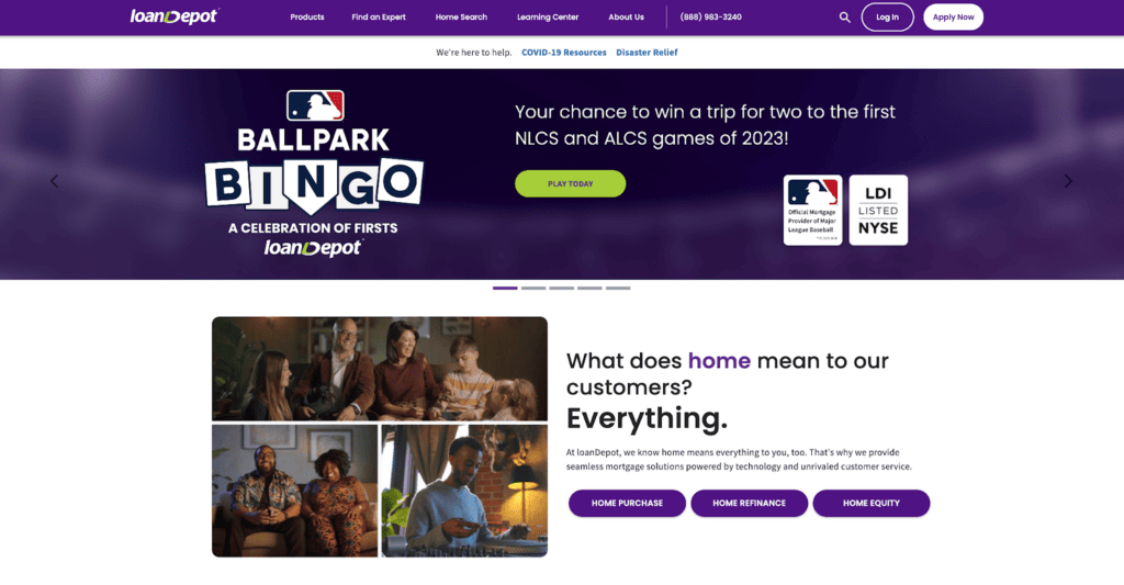
LoanDepot offers a clean, user-friendly interface that provides visitors with the necessary information without overwhelming them with too much stuff.
Here are some key features of LoanDepot’s website:
- Clear information on loan types and loan pages
- Personalized loan estimate forms
- An extensive knowledge center filled with blogs, articles, and guides
- Customer reviews, ratings, and testimonials prominently featured for social proof
U.S. Bank
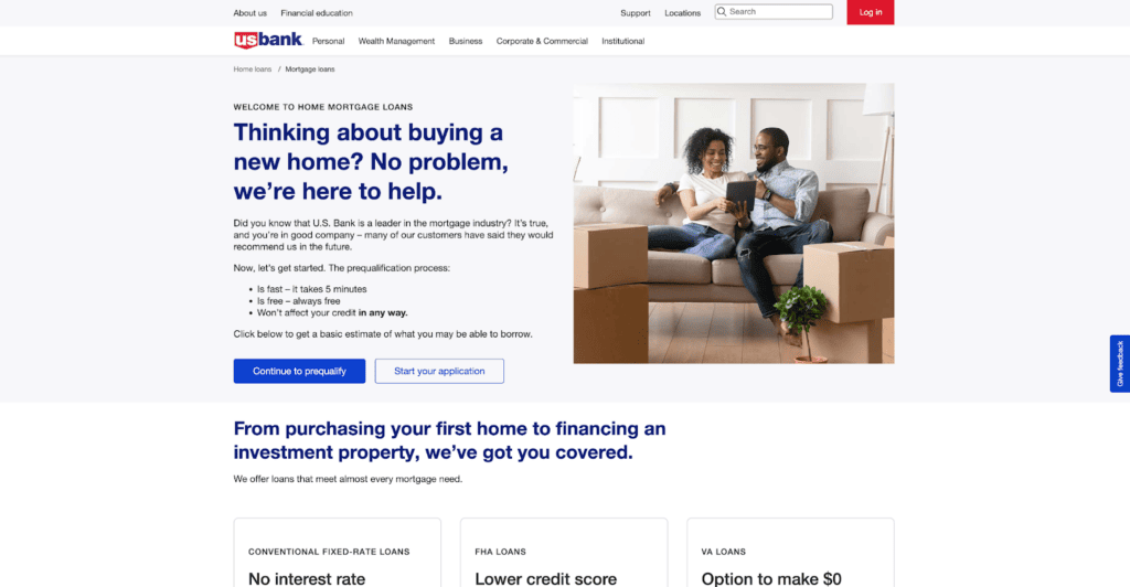
U.S. Bank offers a clean, intuitive website with plenty of interactive tools and resources for mortgage shoppers.
Here are its website’s key features:
- A variety of different mortgage calculators and interactive tools
- Clear site structure and navigation
- A large learning center filled with blogs, articles, and guides
- A fully digital application process
Fairway Independent Mortgage Corporation
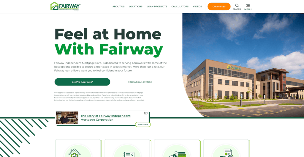
Fairway Mortgage has built a reputation for exceptional customer service, and its website plays a key part in this.
Here’s what I like about their website:
- User-friendly design with clean, uncluttered navigation
- A local branch locator to help people find their nearest mortgage consultant
- A learning center with tons of blogs and guides
- Fully online loan application
- Loan officer profile pages with detailed profiles, contact information, bios, and video introductions in some cases.
Kaleidico — a mortgage marketing agency
Kaleidico is a full-service marketing agency and lead generation firm for mortgage lenders, loan officers, and fintech companies.
We know mortgage—Get 20 years of mortgage lead generation experience with Kaleidico.
Photo by Pixabay.