Your potential borrowers are online right now searching for “mortgage rates”, “rates for home loans”, and “what are mortgage rates today?”.
And guess what? If your mortgage website doesn’t have a mortgage rate widget or calculator, you’re not going to get any of that traffic!
If you’ve been on the fence on whether or not your mortgage website should include mortgage rates, let me tell you it absolutely should!
Don’t be afraid of showing mortgage rates because you think it might scare borrowers away — it will actually attract more borrowers to your website!
In this guide, I’ll cover mortgage rate widgets, show real-life examples of the best rate tables, and explain how adding these interest rate calculators can generate more leads for your company.
Why lenders should include rate tables on their website
The first place home buyers and home refinancers turn to when researching mortgages is Google — specifically typing in “mortgage rates.”
If not that, then “mortgage calculators,” because naturally, homebuyers need to learn if they can even afford to move into a new house.
However, in my experience working in mortgage marketing, I’ve encountered tons of mortgage lenders who absolutely do not want to advertise the current mortgage rates, fearful that their visitors will be scared off by high-interest rates.
By not including mortgage rates tables, or mortgage rate widgets on your website, you’re missing out on a TON of mortgage-related traffic.
Because you know who does have a daily rate chart on their website? Your competitors! And guess which mortgage lending website gets more clicks, ones with rate tables or ones without rate tables?
Displaying mortgage rate tables on your website is integral for your search engine optimization (SEO) efforts to capture Google traffic related to mortgage searches. But there are actually more benefits than just driving traffic:
- Rate tables generate more engagement on your website, making borrowers stay on your website longer, which increases their odds of submitting their contact info.
- More engagement on your website improves your SEO, making your website appear higher in Google search results.
- Mortgage rates can be used to build email subscriber lists for your newsletter and lead nurturing campaigns.
- Rate tables can qualify your website traffic by weeding out visitors who aren’t ready to get a mortgage.
- By helping your visitors understand their monthly payments easier, you’ll earn your visitors’ trust and be more willing to work with you than your competitors.
- Mortgage rates will help set expectations on the current mortgage rates.
So, should you add a mortgage rate table to your website? Definitely!
Tell us about your next project and goals.
What should a mortgage rate table include?
Adding a mortgage rate widget, or a plugin, to your website is a relatively simple process, especially if you’re using WordPress.
However, there are several rate table widgets available, so you’ll want to make sure you download the one that includes the right data fields to give your readers enough information to help them determine their rates.
Let’s go over the key features to include in your mortgage rate table widget so you can design the best rates page for lead generation:
Show indicative rates for popular loan programs
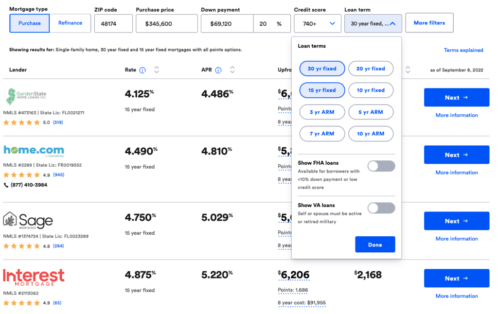
Bankrate, which is arguably the most popular mortgage rates table online, shows the two most popular mortgage term lengths — 30-year fixed rate mortgage and 15-year fixed rate mortgage by default.
Additionally, there are dropdown menus that can be selected to show less popular term lengths such as 20-year fixed, 10-year fixed, and 5-year ARM.
Show other important rate and index trends such as 10-year treasury yields
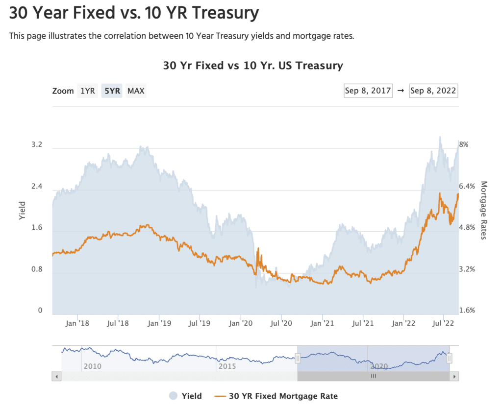
Not only do borrowers want to see popular term length rates, but they also like comparing 30-year fixed rates against 10-year treasury rates.
Adding additional charts and rates can give your borrowers more of a full picture view of where mortgage rates have been and where they’re heading.
Also, consider adding capabilities to your mortgage rate table to compare how the housing price index is performing in comparison with interest rates.
Allow borrowers to compare different loan program rates and trends over time
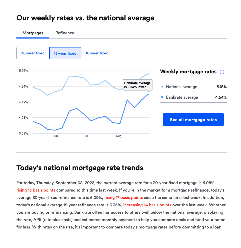
Add more fields to your rate tables to give your borrowers more information to play around with while they’re figuring out their loan amount and payoff schedule.
Make it as easy as possible to change the term lengths to keep your visitors on your website longer so they don’t need to Google “30-year fixed year rates” if they’re only able to see 15-year fixed rates on your website’s rate table.
Add calls-to-action (CTA) and contact forms for borrowers to submit their customer mortgage rate quote
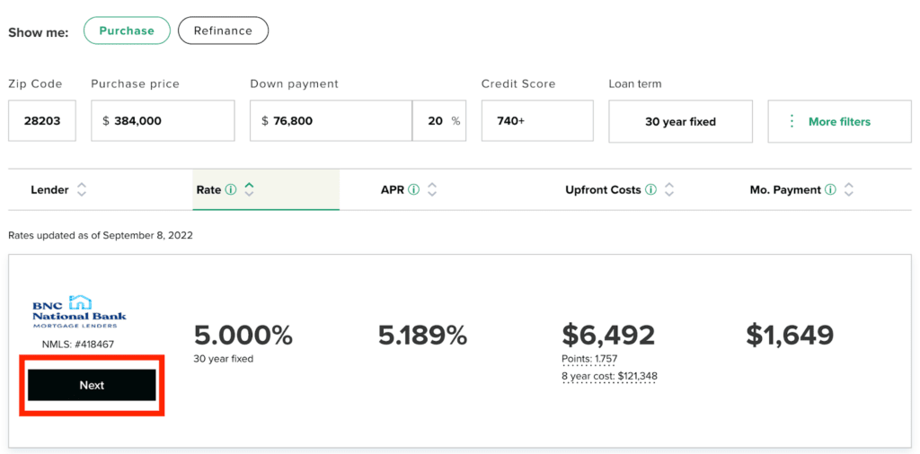
Adding mortgage rates tables to your website is a nice thing to do to educate your readers — but ideally, they should be generating leads for your company as well.
You can choose to simply upload a mortgage rates widget that just displays updated daily mortgage rates. And these work to keep readers on your website longer and pull traffic in from Google searches.
But without a call-to-action, such as “get your free quote now” you’re wasting an opportunity to collect information from these users.
I recommend you do what Bankrate and NextAdvisor do. Give readers an interactive rate table for them to enter down payment information, interest rates, and term lengths, but then add a button that says “Next” to prompt your reader to enter their personal information.
Also, try offering a rate watch email that borrowers can sign up for to get regular rate alerts
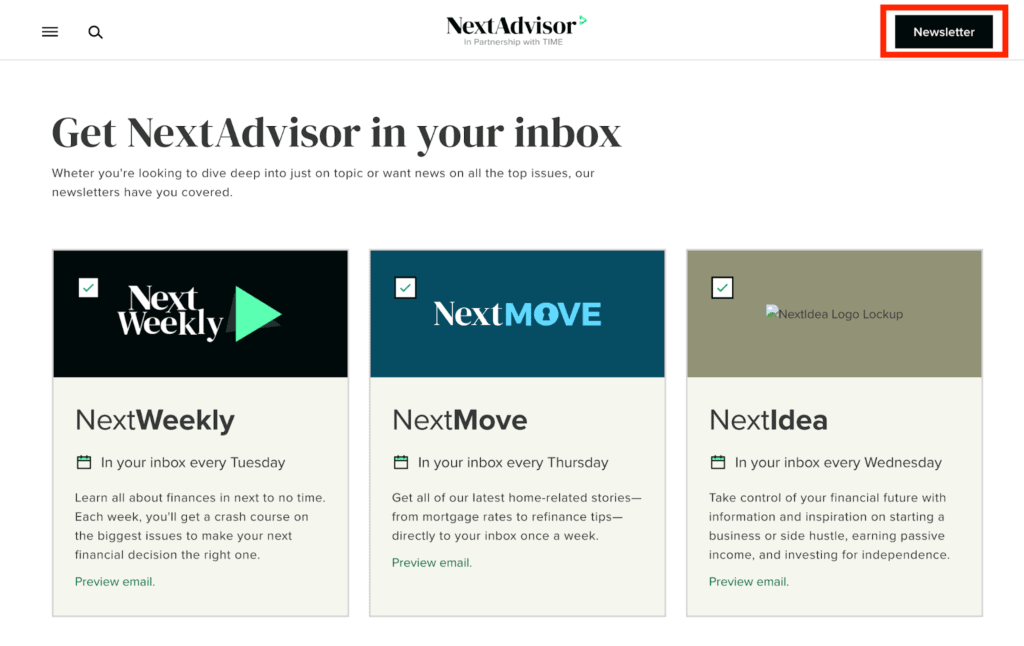
At the top right corner of NextAdvisor’s website is a clickable button simply titled “Newsletter.”
Once a reader clicks on this, they’re redirected to a page that prompts readers to sign up for three different weekly newsletters.
Mortgage rate table landing page optimization for lead generation
Homefinity’s mortgage website and user experience have been optimized for lead generation.

Notice how at the top right of the corner is a CTA to “See Today’s Rates.” This CTA box is shown on all pages of the website, constantly leading visitors to the rates page where they are prompted to “Personalize My Rates” by clicking on another button.
Once a borrower clicks on “Personalize My Rates” a progressive field form pop-up window appears that asks a series of short, easy questions that makes filling out a form much easier than traditional contact forms.
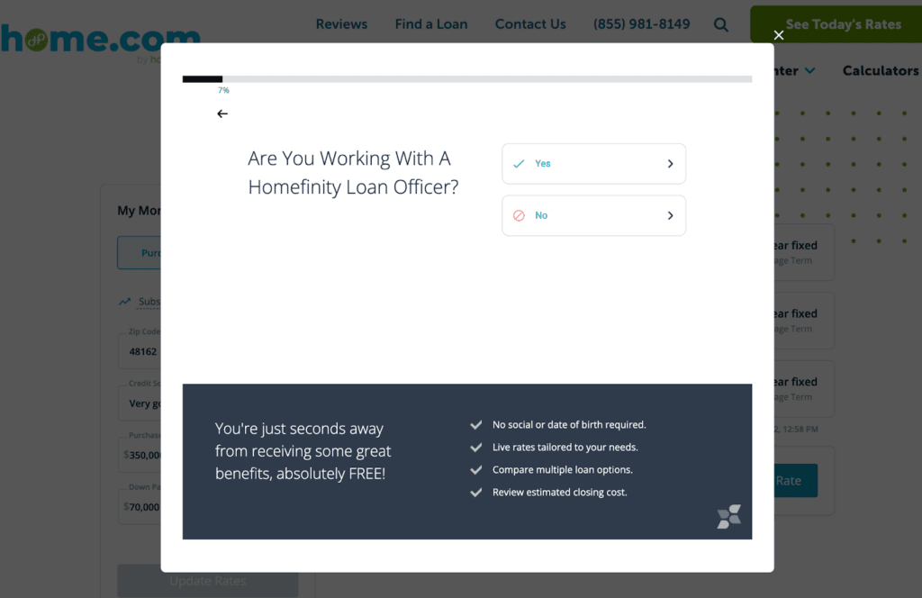
Because progressive forms are smarter than generic forms, they know not to ask redundant questions that can annoy or frustrate your visitors before they finish filling out the forms.
To add more peace of mind for your readers, notice how the pop-up form says clearly “no social or date of birth required” which can reassure them they’re not giving too much personal information.
Within seconds, your web visitor has answered the requisite questions and has officially converted into a new lead for your mortgage company!
Kaleidico — a mortgage marketing company
Kaleidico is a lead generation and mortgage marketing company.
We’ve been helping mortgage lenders and loan officers generate more leads online for 20+ years using our proven mortgage marketing framework.
We’ll build your own strategic custom website that’s optimized for mortgage lead conversion, complete with mortgage rates tables, mortgage calculators, strategic lead paths, and CTAs, as well as SEO, content marketing, and PPC.
Want to grow your mortgage business and generate more leads?
Talk to us about your sales and marketing goals.
Photo by Nataliya Vaitkevich

