
A well-designed mortgage rates page can be the difference between generating leads and simply providing your audience with useful information. The latter is important, but the former is what drives revenue.
While there’s no shortage of ways to design this page of your website, there are some tips you can follow to improve the likelihood of regularly generating leads.
Before we go any further, remember this: Mortgage rates recently increased, so homebuyers are paying close attention to this detail.
The majority of borrowers will spend a good amount of time checking and comparing rates before deciding which lender is best. This makes your mortgage rates page even more important in today’s market.
Design tips for mortgage lead generation
You’re always looking for new ways to set your mortgage lead generation website apart from the competition. One of the best ways of doing so is to design a rates page that’s better than your competitors in every way.
Here are five design tips that can help you do just that.
1. Keep it clean
Potential borrowers visit your mortgage rates page for one primary detail: current purchase and/or refinance rates.
A clean, organized design allows them to find what they’re looking for with minimal or no friction. Here’s an example of a mortgage rates page that we designed for a client.
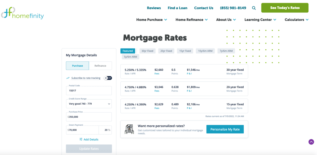
There’s no clutter, there’s plenty of white space, and everything is exactly where a visitor expects it to be. The page was designed to be clean, concise, and informative.
2. Don’t hide the rates
Have you ever visited a webpage in search of specific information, just to realize that it’s turned into a game of hide and seek?
This tip goes along with #1 above. A clean page is a good start, but only if visitors are able to quickly find what they’re looking for. And in this case, they want fast access to current rates.
The biggest mistake you can make is pushing your most important information — in this case, the rates — below the fold. The longer it takes someone to find what they’re looking for, the greater chance there is that they’ll “bounce” from the page before finding it.
3. Include a mortgage calculator
As noted above, the primary purpose of a mortgage rates page is to provide visitors with updated rate quotes. But that doesn’t mean you should stop there. It can help to include a mortgage calculator on the page, too.
It won’t be prominently featured, but a calculator helps to keep visitors on your page longer. And the longer they remain there, the better chance there is of them taking action.
A mortgage calculator can be as simple as:
- Loan amount
- Down payment
- Loan term
- Interest rate
With the help of your rates table, borrowers can quickly calculate a mortgage payment estimate based on their chosen term.
4. Include a call to action (CTA)
Your primary goal is to provide visitors with up-to-the-minute mortgage rates for various types of loans and terms. Tied to this is the goal of converting these individuals into customers. A call to action is necessary to make that happen.
Here’s another example:
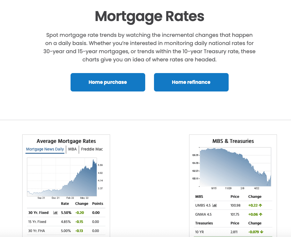
In addition to the average mortgage rates charts, there are two call-to-action buttons: home purchase and home refinance.
Clicking on either of these takes the borrower to a “get a quote” prompt. In a few simple steps, more information is provided, including the person’s contact information. At that point, you have a lead.
5. Design with navigation in mind
You want every visitor to stay on your website until they find exactly what they’re searching for. If they leave prematurely, there’s a good chance they’ll find what they’re looking for elsewhere and never return.
A high-converting mortgage rates page is one that’s designed with navigation in mind. The majority of visitors are coming to your page for rate-related information, but they’ll soon realize that there are other details to consider.
In the first example above, we designed the rates chart to be easily adjusted by loan type:
- Featured
- 30 year fixed
- 20 year fixed
- 15 year fixed
- 10y/6m ARM
- 7y/6m ARM
- 5y/6m ARM
All of these prompts are located directly above the chart for easy use. It only takes one click to make a change.
Furthermore, an eye for graphic design will come in handy. Use this article as an example. Your eye knows where to go because of the changes in font size and style and the use of subheadings. Apply that same knowledge to your page.
The user’s eye should be immediately able to find the rate they’re looking for but that won’t happen as easily if everything is the same size and style.
Some additional tips related to the navigation and layout of your rates page:
- Include your phone number and link to a contact page.
- Share navigation categories, such as about us, learning center, home purchase, and home refinance.
- Clearly separate home purchase and home refinance rates and information.
Answer these questions to get started
You’re closer than ever to a mortgage rates page that generates leads, but there are some basic questions to address before you take your next step:
- What do you like and dislike about your current mortgage rates page?
- What is the conversion rate of your current page?
- How much traffic does your current page receive?
- What keywords does it rank for?
- Do you have any competitor examples to use for inspiration?
In other words, don’t dive in head first without examining what you’ve done in the past and what you want to accomplish in the future. The answers to these types of questions will help you formulate a better design strategy moving forward.
Kaleidico — your web design partner
Kaleidico is your mortgage company’s competitive advantage for transforming your website into a lead generation machine.
With so much competition online, your mortgage website must stand out from the crowd. This helps attract and engage your target audience, thus resulting in more leads and customers.
Tell us about your project and schedule a consultation with one of our experienced web design professionals.
Photo by Kindel Media