You have three seconds. That’s how long your landing page has to convince a visitor to stay, engage, and convert.
In a digital world overloaded with noise and distraction, that initial moment matters more than ever.
Whether you’re a mortgage lender, a law firm, or a senior living community, your landing page is often the first impression—and the only shot you get to turn a click into a customer.
Here’s how to do it right.
Schedule a Discovery Session
Learn how to attract new leads and clients.
Why landing page optimization still matter in 2025
Landing pages are no longer just standalone marketing tools—they’re the connective tissue between ads, emails, SEO, and conversions.
In 2025:
- Over 60% of global web traffic now comes from mobile devices.
- Many users expect pages to load in a few seconds; once load times exceed 3 seconds, bounce rates rise sharply.
That means your landing page has to be fast, focused, and frictionless.
For industries such as mortgage, law, and senior living, landing pages must serve multiple functions: generate leads, build trust, remain compliant, and guide visitors toward meaningful next steps.
10 must-haves for a successful landing page conversion strategy
1. Mobile-first, speed-optimized design
With the majority of traffic now coming from mobile devices, your landing page must work flawlessly on small screens.
That means:
- Responsive layouts that prioritize vertical scrolling and thumb-friendly buttons
- Compressed images, lazy loading, and minified code to reduce friction
- Performance scores above 90 on Google PageSpeed Insights, and passing Core Web Vitals thresholds for speed, responsiveness, and stability
Speed isn’t just about user experience—it’s also a Google ranking factor. A slow page may never be found.
2. A single, focused conversion goal
Every element on the page should support one clear action.
For example:
- Mortgage: “Get My Rate Quote”
- Senior Living: “Schedule a Tour”
- Law Firm: “Get a Free Consultation”
Avoid cluttering the page with secondary offers, extra navigation, or competing CTAs.
3. Trust elements that match your industry
Social proof and credibility indicators reduce friction and build confidence during the decision-making process.
Consider including:
- Mortgage: Display your NMLS ID, Equal Housing Opportunity logo, and secure form indicators. Add trust badges or press mentions if available.
- Senior living: Highlight testimonials from residents and families, accreditations, and caregiving credentials. Real staff and facility photos always outdo stock images.
- Law: Showcase attorney credentials, bar memberships, years of experience, and ethical review badges. Case results (where permitted) can be helpful, but ensure compliance.
4. Messaging that matches the user’s journey
The copy on your landing page should feel like a seamless extension of the ad or email that brought the visitor there.
- Reinforce the offer (“Claim your free rate quote” or “Book a private tour”)
- Mirror the language and tone used in the campaign to build continuity
- Anticipate user intent based on channel (Google Ads, SEO, email)
Consistency builds trust and lowers bounce rates. Mismatched messaging feels like a bait-and-switch.
5. Clear, high-contrast CTAs
Your CTA should be one of the most visually prominent and persuasive elements on the page.
Make it:
- Obvious: Above the fold, with a contrasting color from the rest of the page
- Compelling: Action-focused language like “Get My Free Quote” or “Download the Guide”
- Reinforced: Repeated in key locations, especially after each core section
Bonus tip: Test button microcopy. “Get Started” performs differently from “Schedule My Tour.”
6. Simple, frictionless forms
Your form should feel effortless—not like a burden or a commitment.
Keep it short:
- Start with the essentials: name, email, maybe zip or phone number
- Break longer forms into steps if necessary
- Include TCPA disclosures, opt-in checkboxes, and data privacy messaging
Fewer fields = more conversions. You can always qualify leads further in a follow-up sequence.
7. Strategic use of visuals
Visual content should support clarity and trust—not distract from it.
Use:
- Real photos of people, locations, or staff to humanize the experience
- Short explainer videos to demonstrate services, walkthroughs, or processes
- Arrows, lines, or gaze cues that guide users’ attention toward your CTA
Avoid generic stock photos. They dilute credibility.
8. Above-the-fold clarity
Visitors decide whether to stay or leave within a matter of seconds.
Your above-the-fold area must answer:
- What is this?
- Who is it for?
- What do I do next?
Structure this area with a strong headline, supporting text, and your primary CTA.
Bonus: Add a visual (image or icon) that reinforces the offer.
9. Personalization and dynamic targeting
A personalized experience improves relevance and trust:
- Use geotargeting to insert city/state names into headlines
- Customize the offer based on campaign source (e.g., “Exclusive for Email Subscribers”)
- Use DTR (dynamic text replacement) with tools like Unbounce or Instapage
Even subtle changes, such as displaying different images for PPC versus SEO visitors, can drive increases in engagement.
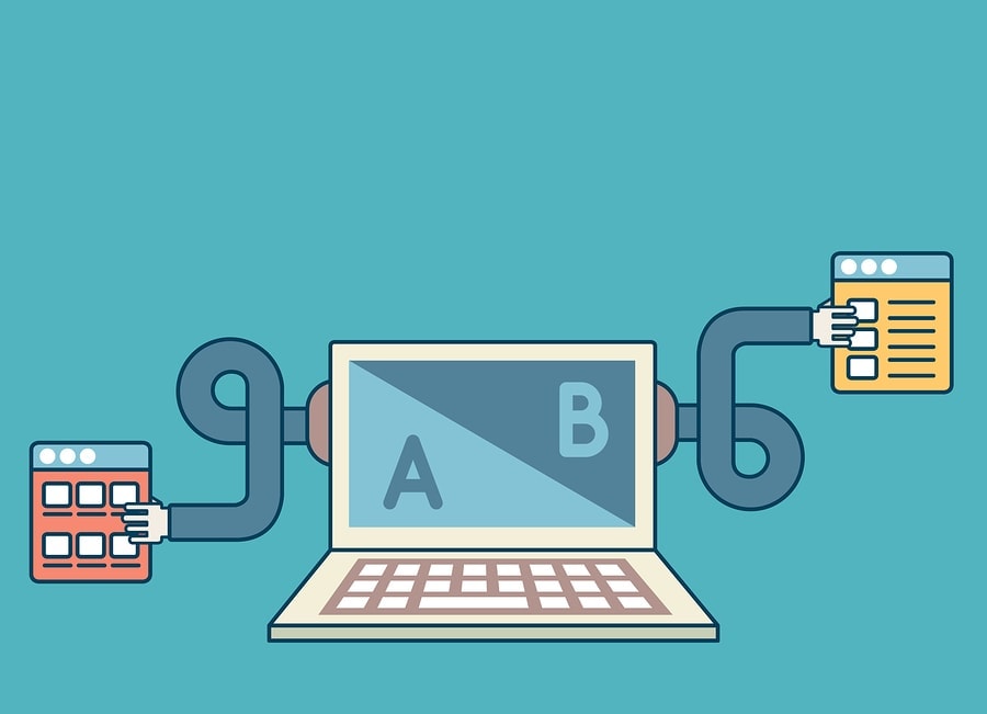
10. Ongoing testing and iteration
Optimization is never over.
Treat every landing page like a live experiment:
- Run A/B tests on headlines, hero images, button text, and layout
- Use tools like Hotjar, Crazy Egg, or Microsoft Clarity to view scroll maps and user behavior
- Set conversion benchmarks and measure continuously (e.g., 10%+ for gated offers)
Landing pages that stagnate lose conversions. The best ones evolve.
What to avoid on landing pages in 2025
Avoid these common mistakes that undermine conversions:
- Multiple CTAs: One clear action only
- Intrusive forms: Too many fields or unclear privacy language
- Generic stock imagery: Erodes trust
- Slow mobile performance: Prioritize page speed and responsive design
- Message mismatch: Keep campaign and page copy tightly aligned
Fixing just one of these often delivers immediate performance gains.
Sector-specific landing page insights
Mortgage marketers
- Compliance first: Follow TILA, MAP, and TCPA regulations. Disclosures must be accurate, visible, and not buried in footnotes.
- Visual calculators and quote previews: These tools help users feel in control and can serve as a soft conversion.
- Local focus: Specify service areas or licensed states in the copy and form dropdowns.
Senior living marketers
- Emotional and practical appeal: Speak to both the heart (peace of mind, community) and the head (pricing, care levels).
- Multiple CTAs for readiness levels: “Book a Tour” for visitors ready to act and “Download a Brochure” for those still researching.
- ADA compliance: Use accessible fonts, alt text, and a mobile-friendly design. Older audiences often require clearer visuals and larger buttons.
Law firm marketers
- Local trust factors: Highlight the city or region served; use attorney bios with photos to humanize your firm.
- Urgency-driven headlines: Legal issues are often time-sensitive. Headlines like “Injured? Get a Free Case Review Today” prompt faster action.
- Stay compliant: Avoid using language like “guaranteed results” or “best lawyer” unless it can be proven. Stick to facts and client testimonials.
Good landing pages aren’t built—they’re optimized
In 2025, a high-converting landing page isn’t about flashy design or clever copy. It’s about precision, empathy, and ongoing improvement.
You need to show the right message, to the right person, at the right time—and make it ridiculously easy for them to say yes.
Ready to build landing pages that convert? Tell us about your project, and let’s design something great together.