Creating better infographics has become a bit of a mission here at Kaleidico since a part of our content marketing strategy is infographic design.
From this experience, we’ve developed a keen eye for what makes a good infographic during each of the research, copywriting, and design phases.
The truth is that design can’t really fix a poorly researched and written infographic. That’s where we want to focus today—how to create a better infographic, beginning with research and copywriting.
Schedule a Discovery Session
Learn how to attract new leads and clients.
Narrow Your Infograpic’s Focus
Good infographics should only address one topic, concept, or argument.
Nothing dooms a good infographic from the start, like an overly broad topic. Although infographics theoretically can be infinite in length, no one’s staying around to browse that one.
Attention span on the Web is fleeting, and although compelling imagery increases time on a page, no amount of design can save a story that meanders endlessly.
It’s not just your web visitors that get bogged down when too many concepts are stuffed into one box- Google also tends to undervalue these kinds of pages.
Staying on topic and tightly focused on a single message will clearly drive your readers to the outcome you want.
Make Your Infographic Readable
Good infographics should tell a story, but only one chapter at a time, leaving readers eager to move to the next chapter.
Every organization, big idea, product, or service is filled with a nearly infinite supply of stories to be told.
This is why a pen enthusiast can write for six years only about pens, or scientists can devote their whole lives to some pretty absurd research studies.
The point is this: don’t feel compelled to throw everything you know about something into one infographic.
Why doesn’t that work? Here are just a few reasons:
- Your readers are catching up; they aren’t experts. Getting too deep too fast will cause them to seek a more simple explanation–resulting in their departure from your page.
- Chances are they landed on your infographic due to a specific search. Staying focused on that very narrow concept will leave them satisfied and ready to take the next action you recommend.
Covering one topic with clear simplicity will give them the confidence to advocate your company to their management and colleagues, buy your product, engage you about your services, or dig deeper into your website to go to the next level of knowledge—all behaviors that lead to revenue for your business.
As you begin to brainstorm your infographic, lay out all of the potential messages and data you have available and watch the storylines emerge. Then begin to organize them into single topic infographics (chapters in a much larger story).
Your infographics should turn into page-turners in the style of good novels. Each infographic should leave the reader eager to see what’s next.
Find the Right Kinds of Statistics
Infographic data should always be presented in a larger context, either through representing a comparison, scope, or scale.
In the list of infographic mistakes, the appropriate use of statistics tops the charts. Contrary to popular belief, any old number doesn’t make infographic material.
Keep in mind that infographics are meant to tell a story or make a compelling argument, so you need numbers that move the story forward and strengthen your storyline.
Comparative data is typically the most effective
Statistical data that places your infographic concept in the context of the larger market or places it up against the competition—assuming the comparison is favorable – is naturally compelling.
Considering that a good infographic should be educational and persuasive, comparative data is the fastest way to the objective.
Even data outside of the comparative genre needs to fit into a larger context. Simply sticking in a number with nice typography doesn’t get the job done.
A perfect example of this is how some data representations can give your reader a sense of scope and scale. The bottom line of data for your infographic is that isolated numbers aren’t compelling.
All of your data must be placed into some kind of context that renders it interesting. Your data must equip the reader with a clear understanding of why this information is important.
Infographics should, at a glance, give the reader an understanding of how this data fits into the larger context of the market or world within which it exists.
Create an Infographic Readers Want to Share
Infographics should be persuasive–make a compelling argument for why I’m looking at this thing. Infographics that don’t are probably one of my biggest personal pet peeves.
Start with some fundamental assumptions or misconceptions and walk your audience through a story that either reinforces or corrects assumptions about your topic.
Please don’t just dump fancy-colored data on an infographic and not work hard to make me care about it. At the very least, I want to make it interesting and esoteric enough to make me look smart enough to share it.
Be persuasive. Make a compelling argument that inspires me to study and share your infographic.
No one wants their time wasted. Give me a reason to care about the infographic you took so much time creating.
Show Don’t Tell
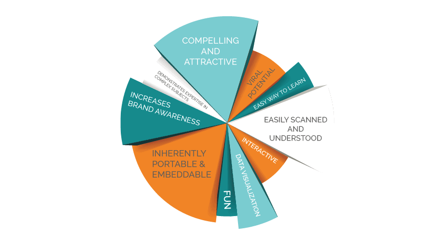
The real power of an infographic is the visual nature of the medium.
This should always be at the top of mind when making choices between showing (visuals) and telling (copy)—visuals should substantially outweigh copy, at least 4:1.
Copy text should be limited to a bare minimum to label and guide folks through the data visualization experience.
Quickly convey context and significance without undue copy–showing you an interesting and relevant story.
Always Conclude Infographic With a Clear Call to Action
Here we are at the end. If you’ve made it all the way to this point, you probably have a real interest in the topic. You’re probably even buying into my perspective on the topic.
That makes it a perfect time to pitch you on the next step: Never drive your audience to the end without a strong call to action, a clear and specific next step.
For example, Let Kaleidico optimize your marketing with expert infographics and more.
Start by scheduling a discovery session.
Creating an Effective Infographic: The Checklist
Just in case you’re one of those people who read the last page first or simply cheated and scrolled all the way to the bottom for the bottom line, here’s the punch list for making a great infographic:
- Good infographics should only address one topic, concept, or argument.
- Good infographics should tell a story, but only one chapter at a time, leaving readers eager to move on to the next chapter.
- Infographic data should always be presented in a larger context, either through representing a comparison, scope, or scale.
- Be persuasive. Make a compelling argument that inspires me to study and share your infographic.
- Copy should not exceed visuals. The ratio should eyeball at something like 4:1 and no more than 250 words. (Yep, longer than that, and you’re writing an ebook, not an infographic.)
- Copy should be limited to the bare minimum to label and guide folks through the data visualization experience.
- Never create an infographic without a strong call to action