Searching for information online isn’t just a convenience; it’s how people actually make some of their most life-changing decisions—including buying a home.
Most prospective homebuyers today want an online process, from the initial research all the way to closing on the loan.
The need became more urgent during the COVID-19 pandemic, but the trends have been heading in this direction long before then.
Since this is a new reality in the mortgage industry, lenders, loan officers, and mortgage brokers must establish the essential component of an online mortgage process to meet these borrowers where they are—their mortgage website.
In this guide, we’ll dig into all the features of a mortgage website, including the most effective ways to optimize your site, what you should leave out, and how to get started.
Schedule a free discovery session to learn how Kaleidico can fit into your marketing strategy.
Why do lenders and loan officers need a mortgage website?
A mortgage website is your digital office space, so it needs to be clean, inviting, and dynamic.
Your mortgage website has to include all the information a prospective customer would need to successfully move along the lead path, apply for a mortgage, and eventually seal the deal.
From the perspective of a larger mortgage marketing strategy, all the branches will reach back to your home base — your website. Think email marketing, social media, video, and more.
All these components need to land somewhere, and this “somewhere” will be on your website’s home page, a corresponding landing page, or the application form.
What makes a good mortgage website?
A good mortgage website has some essential layers, such as landing pages, backed by a clean, bold design and a thoughtful content marketing strategy.
At Kaleidico, our content marketing programs are based on search engine optimization (SEO) research, competitive analysis, and the customer’s buying journey.
Your content marketing strategy should be unique to your company’s goals and frequently evaluated for its effectiveness.
Let’s take a look at some specific components you’ll need to include to optimize your website.
Positive user experience
A positive user experience should be your top priority.
Consider how it feels to click onto a website and find a cluttered mess of content, constant pop-ups, and no clear direction of where to go or how to find what you’re looking for.
Not only is this a frustrating experience, but it leaves a lasting impression on your company. It only takes seconds for a new user to judge your page, and once they leave, they’re not coming back.
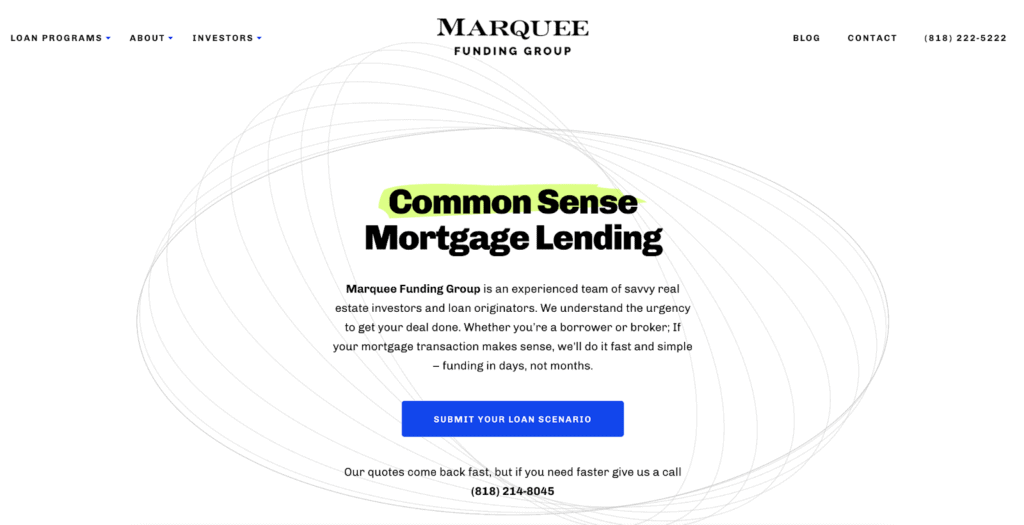
On the other hand, a positive user experience draws the visitor in with a bold, clear positioning statement that succinctly explains who you are and what you do, followed by a call to action (CTA) that effortlessly pushes them along the lead path.
Clean, bold homepage design
Your homepage design is the first step to a positive user experience.
Here is where you’ll display your positioning statement, which explains who you are, what you do, and why, and prominently display the next steps for the visitor in the form of a call to action.
Your homepage will also contain all the menu items that take the visitor to other areas of your mortgage website, including a home purchase or refinance, contact information, loan product pages, reviews, and more.
Online application buttons
The most prominent CTA button on your homepage should be the online application for a purchase or refinance.
If you think of your mortgage lender website as your digital office, consider what you do when a new customer walks in. You’ll introduce yourself, ask what they’re looking for, and direct them to their next steps.
Mortgage websites have to do the same thing digitally, and clear CTAs tell a visitor exactly where they need to go to complete a certain goal.
Landing pages for each mortgage product
Mortgage website landing pages are the meat of the site.
You will need a landing page for each of your mortgage products, including conventional loans, FHA loans, VA loans, refinance guides, and anything else you offer.
You’ll also need pages for your team members, reviews, mortgage calculators, and your blog.
Each landing page will be optimized with important keywords that will help visitors find your website through Google searches. This means that, for example, if you want to attract an audience searching for FHA loans, you’ll want to include that term and its synonyms in the copy of your web pages.
You will also place essential CTAs on each page so that you can provide opportunities to apply or contact you at every stage of the visitor’s journey.
Social proof to build trust and connection
Include “social proof” in the form of customer reviews and testimonials on your website to prove you are legitimate and trustworthy.
You have control over which reviews you show on your website, but remember that you may not seem as trustworthy if you only have glowing 5-star reviews.
While it’s a good idea to hide the strange one-star review from a client who clearly has mistaken you for somebody else, keep in mind that your visitors can see all reviews from Google, Zillow, or Yelp.
Lead capture opportunities
There are many creative ways to capture leads these days that don’t involve incessant pop-ups or outdated contact forms.
Instead, you can collect leads through gentle lead paths, or progressive forms, that begin with the simple click of a bold CTA button and take the user through a series of questions one at a time.
All questions are relevant, and each one builds based on the answers. This is a much less frustrating way to guarantee a lead capture.

You also can strategically place lead magnets throughout your mortgage website, which offers a free, downloadable item in exchange for contact information.
The download might be an ebook on the home buying process, a webinar, or a template.
Optimized for mobile
Half of all the traffic to your website is on a mobile device.
If you’re not sure if your current mortgage website design is optimized for mobile, go ahead and Google it right now.
If it looks just like your desktop website, only smaller, it’s not mobile optimized. A mobile-optimized site is redesigned for a smartphone, with a simple layout and navigation and shortened text.
Mortgage lender websites that are optimized for smartphones make it easier to capture leads because your mobile users won’t have to take the extra steps to bookmark your site and remember to pull it up again later on a desktop (side note — they probably won’t do that anyway).
Quick loading times
According to a study from Google, if your website takes longer than three seconds to load, more than half of your visitors will leave.
There are many factors that influence the loading speed, including the size of your files and your server performance.
If you’re not sure what that means, it might be helpful to connect with a full-service mortgage marketing agency that can help you optimize your website and craft a unique content marketing strategy.
Common mistakes that hurt your mortgage lead generation
If you have an existing mortgage website that generates a fair amount of leads but isn’t performing the way you need it to, there could be several reasons why.
The following are the most common mistakes mortgage professionals make with their current sites.
Using traditional web forms
Traditional web forms are prime targets for spambots, which submit fake information in your web form in the hopes of hijacking your website or email lists.
If you’ve noticed an increase in spam submissions, your site is a target for the spambots because of your web form.
Not only are you attracting spam with the form, but you’re pushing away potential customers who aren’t interested in filling out a contact form with no incentive.
Instead, you should switch to progressive forms that eliminate the spambots and make submitting information much easier for your visitors.
Using online 1003 or mortgage applications from your loan origination system (LOS)
Your loan origination system (LOS) can create a version of the 1003 form that many loan officers embed on their websites as-is.
While having prospective clients fill out this form for you sounds nice, the problem is that most prospective clients end up abandoning the form due to its length and complexity, resulting in no conversions for you.
Instead, create an online lead path with information from the form that occurs as a natural progression of questions.
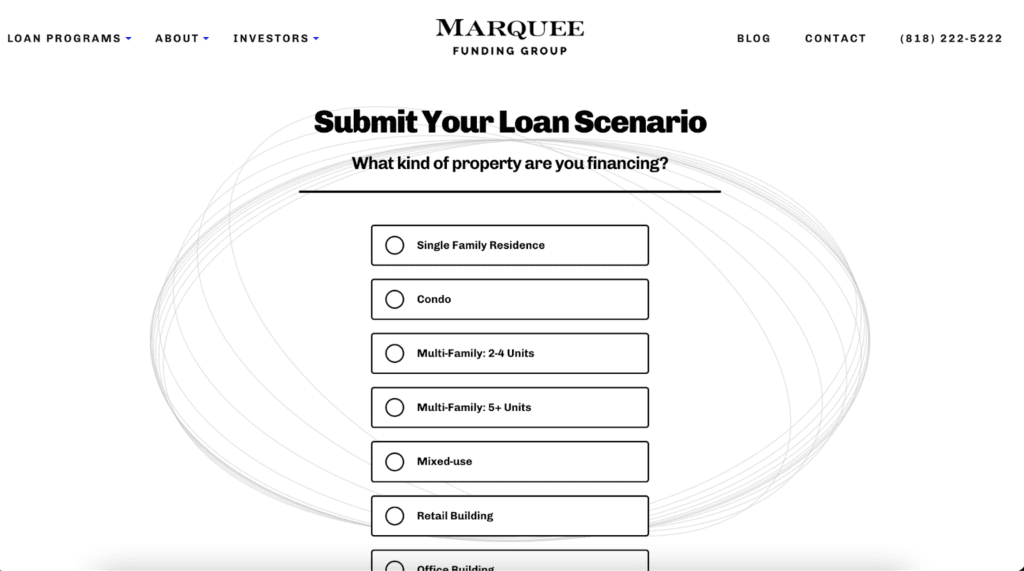
This approach makes components of the form much easier to digest while still providing you with essential information about the customer to get started.
Pop-ups
Pop-ups are definitely annoying, but they’re actually worse than annoying—they’re ineffective.
Once a user lands on a page and starts digging into the information, it can be frustrating for them to have to navigate one pop-up after another before they can continue.
Nowadays, users know the pop-up game. Instead of looking at the information within the pop-up, they’re automatically looking for the “X” to click off it. Or, they might just leave your page altogether if they’re frustrated enough.
At Kaleidico, we use lead paths, progressive forms, and lead magnets to gather information organically rather than pop-ups.
Too many distractions on a page
Beyond pop-ups, there are a host of other distractions that can turn off users and make them feel like your site is too complicated or irritating to navigate.
Distractions such as chatbots that ding and open without prompting, videos that autoplay, ad bars that expand or follow users down the page, or design elements that flash or blink are some examples of elements you should avoid on your website. These components will also slow your load time.
Keep it clean and simple, and you’ll keep the user’s eyes on the page for far longer.
Not optimized for mobile phones
Consider this: 75% of the leads Kaleidico generates are submitted from a mobile phone.
If your mortgage website isn’t mobile-optimized, you could be missing out on 75% more leads.
Make it easy for your customers to read your blogs, view your loan product pages, apply, or contact you all from their smartphones or tablets.
No branch or loan officer pages
Your potential customers want to know where you are and who you are. Seeing names, faces, and locations is going to build trust and familiarity.
If your loan pages are too general, users aren’t going to want to hand out their precious contact information to you.
Trust is huge on the web, especially when it comes to such an important life decision.
To show potential leads you are a real, genuine mortgage professional with a license, office location, and contact information, build a team page with unique pages for each loan officer.
No unique positioning statement or CTA at the very top of the home page
Your positioning statement should be located prominently on your homepage, followed by a bold CTA button.
If you don’t have one, you’re missing out on your most valuable first impression, and a prime opportunity to direct the potential customer to their next steps on the lead path.
The purpose of the positioning statement is to briefly explain what you do and how it’s different from everyone else. It’s followed by a CTA button, such as “Purchase a home,” or “Refinance.”
This winning combination is clear and to the point, telling users exactly how you’re going to help them and what they need to do next.
Too many photos
Your positioning statement and CTA combination usually are accompanied by a simple photo that illustrates what you’re trying to express.
You might include a stock photo of a person signing a document, a smiling couple, or a family moving into a home.
If your homepage is cluttered with photos, it will distract users from your statement and pull their eyes away from your written content, which is ultimately what they need to see.
No content
A simple website is effective, but there is such a thing as too simple.
A carefully crafted content marketing strategy is truly the key to your mortgage website’s success. If you’re lacking content, not only are you missing the leads you’d pull from Google search, but you’re not providing the user with the valuable information that will convert them.
Why should they get a quote from you? Why are you different? How will you help them and make this experience different from the competition? And what kind of informational resources can you offer to potential home buyers?
Address these questions in your content to get them to hit “Apply.”
No loan program pages
Borrowers will hesitate to reach out to you if they don’t know what you offer.
Each lender offers different loan products, so don’t assume your website visitors understand what you have or how it works with your company.
Build pages for each loan program, including conventional loans, FHA loans, non-QM loans, hard money loans, or any other loans you offer.
Explain the benefits, the requirements, and how to apply, or contact you with questions.
You’ll attract the audience searching for these terms by showing up on the search engine results pages (SERPs) and including them on your site.
No borrower scenario pages
In addition to your loan program pages, it’s helpful to include borrower scenarios so your visitors can understand which loan type is best for them.
Borrower scenarios might include first-time homebuyers, investors looking to purchase a second home or vacation home, veterans or active-duty service members, or those who want to cash out on their home equity to pay off high-interest debt.
Identifying profiles for your borrowers also helps guide the types of content you create by having a clear audience for your informational blog posts, videos, and more.
Talk to Kaleidico about a website audit for your mortgage website.
Landing pages for your mortgage website
Now that I’ve touched on the types of pages you’ll want to include on your mortgage lending website, let’s look at what’s typically included on these pages and how they should function.
Homepage
Your homepage is your first impression, so it needs to be spot on.
In the following example, the unique positioning statement, “Home loans with a personal touch,” is displayed in green bold font.
They follow up by stating they will treat you like family with a simple, personalized loan process.
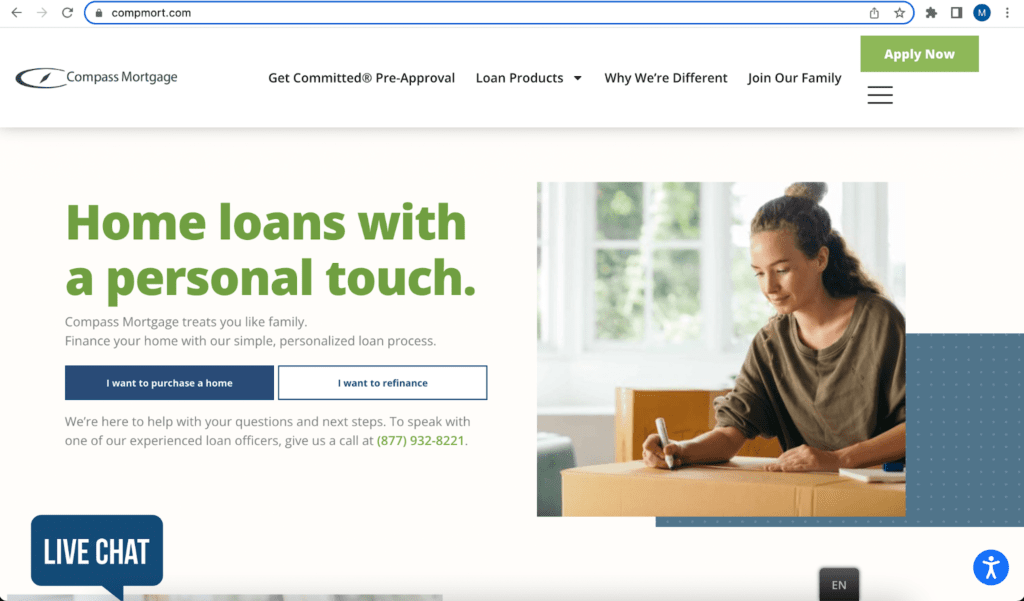
Next, they have bold, clear CTAs, directing the user to click one button if they want to purchase a home or click the other if they want to refinance.
Clicking on a button takes the user to the correct progressive form so the loan officers can collect information about the user for the next steps.
The homepage also prominently displays the menu, with links to the loan product pages and more information on the Compass Mortgage team.
About us
Your “About us” page can have its own unique flair, such as the “Why We’re Different” page, or you can present it as the next example, with an “About Us” dropdown.
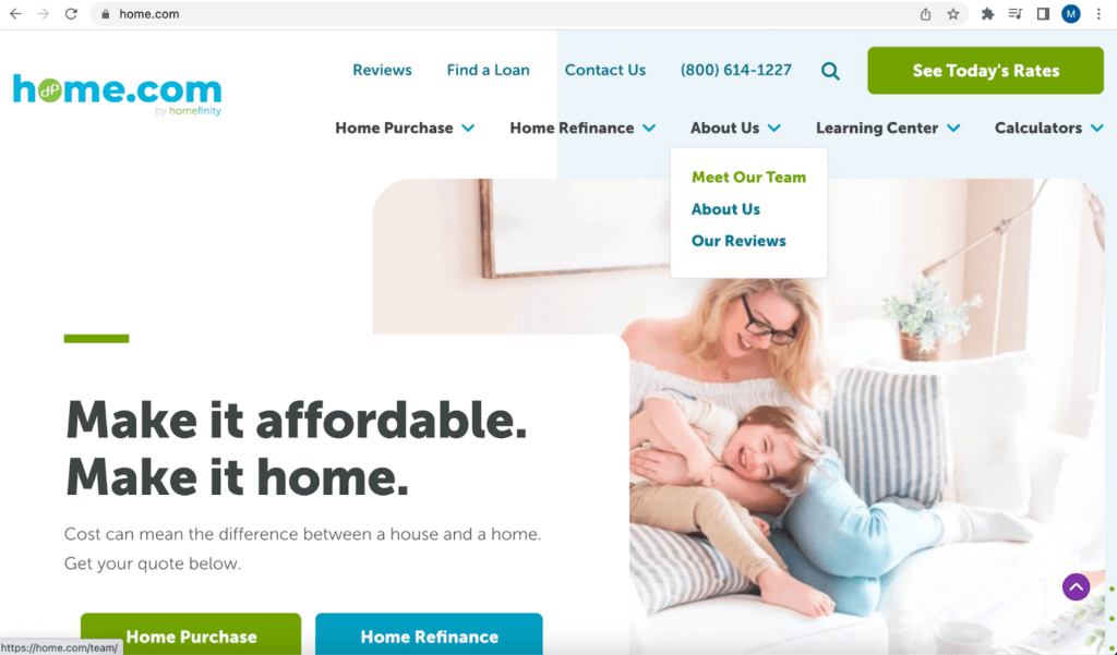
Either way, you’ll want to include a page introducing your team members.
Loan officer profile pages
Each LO profile page should contain their NMLS number, contact information, and link to the online loan application.
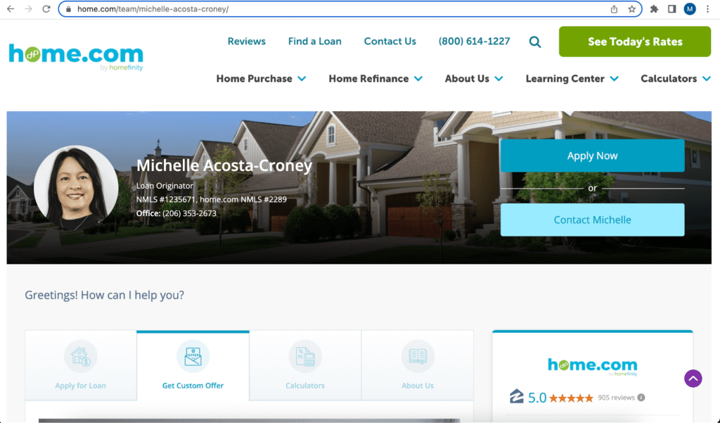
Take a high-quality, friendly photo of yourself to display on the page. Ideally, take it outside for the best lighting with a relatively solid background.
Write up a bio that is informative, customer-focused, and reflects your personality. Mention the types of loans and scenarios you specialize in, and make sure you have complete contact information.
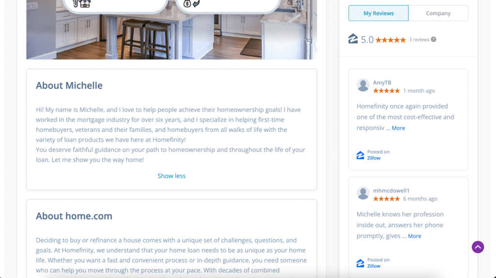
Including reviews on your LO profile pages also gives visitors extra insight and helps build trust.
Anybody searching for Michelle specifically will be led to Home.com and all the information they need.
Reviews page
One of the top searches for any mortgage lender is “[mortgage lender name] reviews.”
Make sure you have a page by that name, and you’re sure to rank on page one for that search instead of another random reviews website.
Curate your best reviews and post them on your website or profile pages.
Branch pages
Customers like to work with their local businesses and professionals, so don’t forget to leverage your location.
Google gets this, too, and rewards local companies with preferences in search results. Make sure that you have a branch landing page for each of your locations.
You also should set up a Google Business Profile for each branch. These profiles are the centerpiece of how Google returns the “best option” in searches for local service providers.
Set up your Google Business Profile listing and fill it out completely. Then, regularly add new pictures and posts to keep them fresh and accurate. Google loves this.
Loan product pages
Before you even begin your journey into paid advertising, you need to make sure that you have a way to turn clicks into leads.
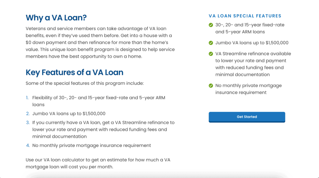
Your first step is to have a compelling landing page for each of your loan products.
The most straightforward possible conversion rate optimization pattern we can give you is this:
- Loan program name
- Who the loan is for (borrower scenario)
- Top benefits of the loan type
- A web (lead) form and contact information
In the example above, clicking the “Get Started” button leads users to a progressive form meant exclusively for borrowers who are interested in a VA loan.
Blog page
Blogging is at the heart of content marketing. Blog content can be evergreen or related to current news and topics, like the impact of the changing market.
By posting informative content on a regular basis, users will rely on you for insights about their mortgage needs.
Within blog posts, include CTAs that users can easily access to connect with you and take the next step, becoming leads.
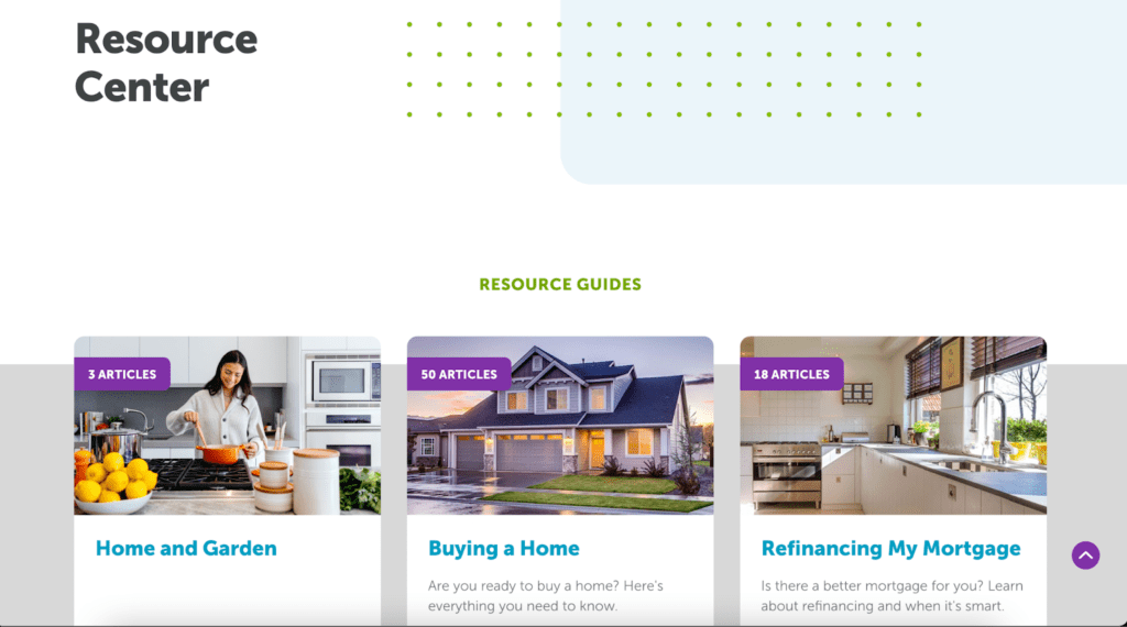
Blogging also provides opportunities for building organic traffic with SEO. By linking articles strategically, you can pull users further into your site to follow a path to all the information they need as they research.
Every time a borrower asks you a question or gets confused during the mortgage process, write about it and post it to your blog.
These frequently asked questions, pain points, and common misunderstandings during the mortgage process are exactly the types of things that borrowers turn to search engines to figure out.
When you write up the most high-quality, complete answers to these common questions — and include relevant keywords — you start popping up in a range of searches.
Ultimately, these blog posts will start bringing you mortgage leads who trust you because of the information you’ve already provided them.
Leverage SEO throughout your website
Blogging and SEO are essential for building long-term, ROI-crushing mortgage lead generation.
Using SEO, you can optimize all content on your website, including your mortgage web pages and blog posts, to achieve a higher ranking on Google organically (non-paid).
Keyword research and traffic analytics will help you see what’s reaching your audience and what they might need more of so you can continue tailoring your content.
We’ve seen great results when we combine this data with understanding your potential customer’s perspective. Are they comparing loan products, learning about credit scores and finances, or wondering about the current market?
This often includes much of the information you’re already sharing in conversations with your customers.
From there, the information can be repurposed across several channels, including emails, social media, videos, infographics, webinars, and more.
Contact page
Why would you need a contact page if you’re sprinkling contact info throughout every page on your website?
For starters, it’s another SEO opportunity, but it also just keeps a user’s journey on your website as straightforward as possible.
A “Contact Us” page invites the user to reach out if they need anything at all — they want to chat, they have questions, or they need a recommendation.
To some people, it may feel like less pressure than applying because they don’t have the answers to all of those questions yet.
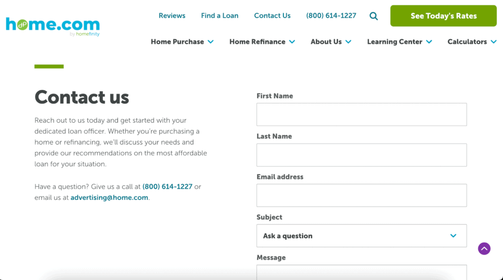
Your contact page should ask for basic information, such as the user’s name, email address, and a message box, and it will also include your phone number and email if they would prefer to reach out.
Thank you page
A thank-you page will appear once the user has finished completing a form or offering up their contact information in exchange for your lead magnet.
Your thank you is an expression of your gratitude for the user moving forward with your services, but it is also another opportunity for additional CTAs or instructions for the next steps.
You may also want to consider recording and embedding a thank-you video with extra information for a personal touch.
Optimize your mortgage website for lead generation
So, what does mortgage lead generation optimization really mean?
If you don’t have a mortgage website yet, then you can design a great website based on the information we provided in this article.
Create a bold, attractive homepage and pages for each mortgage product, embed progressive forms, and weave relevant keywords into all content.
If you already have a mortgage company website, it means you’ll redesign it and include all of these tactics. You’ll take a look at each piece of your website, sift through your content, and make it better.
This includes creating a content marketing strategy that will keep a steady stream of fresh, relevant content on your site, ensuring it pops up in Google searches and gets more eyes on your pages.
Since you already have site visitors, your first aim is to keep those visitors on your website as long as possible. The longer they’re on your site, the more likely they are to reach out.
Revisit your website and content strategy with Kaleidico.
How to create a mortgage calculator for mortgage website
Are you familiar with the formula “M = P [ i(1 + i)n ] / [ (1 + i)n – 1]”?
That’s how you calculate a person’s monthly mortgage payment.
Instead of pasting that intimidating formula onto your website, successful mortgage websites use plugins or widgets to embed simple, functioning calculators onto their sites.
You should create separate landing pages for each type of calculator. The most common calculators include mortgage payment, loan comparison, and refinance.
Some mortgage lenders balk at including a mortgage calculator or mortgage rate tables on their website because they think it’s difficult to offer up this information when there are so many variables.
They also don’t want to be misleading: What if the rates/trends don’t match what they offer?
However, as long as you explain to your visitors how it works and that you’re using mortgage rate trends or ranges to help them gauge an estimate, there’s no harm in offering these essential tools.
Think of it like this: You’re empowering your potential customers by sharing educational tools that demystify the mortgage process.
You’re giving them just enough to get involved and get curious and then leading them to a CTA for the next steps or calculator results. You’re not promising anything—you’re simply educating and encouraging them.
How to include rate tables on your mortgage website
You can embed mortgage rate tables onto your website just like you did your calculators by using a widget.
These widgets will update automatically as the averages they follow update, meaning it’s hands-off for you.
If you’re unhappy with the widgets available to you on your mortgage website platform, you can hire a mortgage marketing agency with developers on their team who can create custom Excel formulas and transform them into beautiful calculators.
Note on the page that the rates are simply surveys, averages, or comparisons, NOT your actual rates.
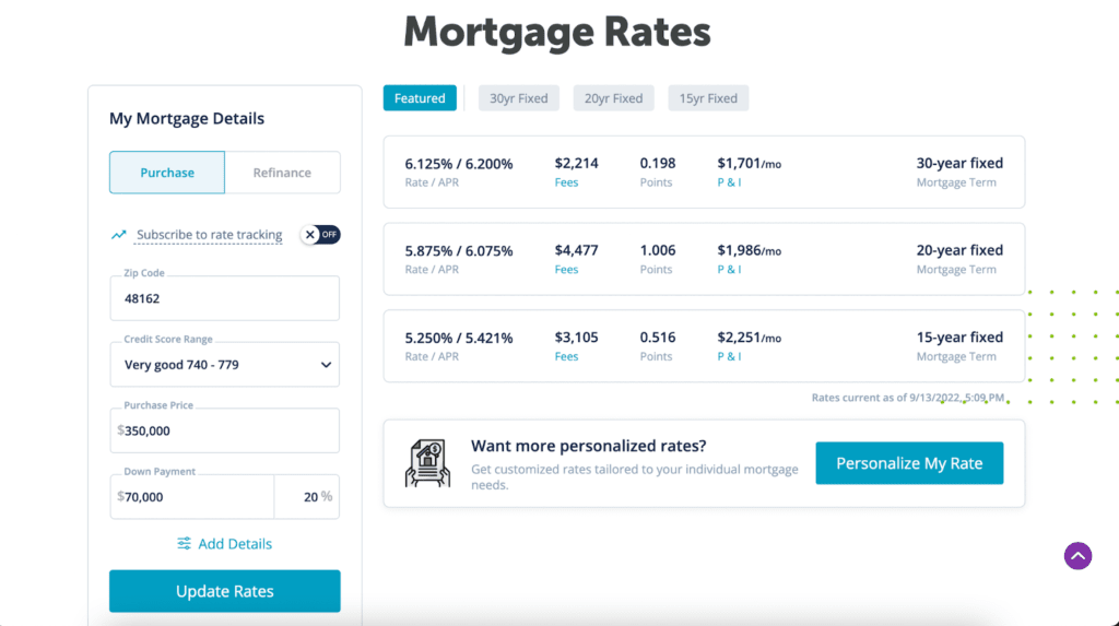
You can also follow the example above and encourage users to get a more personalized rate by clicking the CTA button, which will lead them to an application and/or contact information.
Mortgage rate tables and calculators are simply extra opportunities to let users play around with their options, but leave it open-ended enough that their next obvious step is to connect with you.
They also are additional content marketing opportunities meant to grab some extra keywords or be included in blog posts and shared on social media.
What is a bounce rate? Why do users leave mortgage websites?
When a user lands on your website and leaves within 30 seconds without clicking on another page, that’s considered a “bounce.”
If a user bounces, it means your website didn’t meet their needs, either because your referral link’s meta-description was misleading, your website didn’t load properly, or you’re targeting the wrong kind of person.
I’m sure you can think of a time when you clicked on someone’s website and, within seconds, realized it didn’t have what you needed.
Your readers are going to do the same thing. They will quickly scan your site and make note of whether the website easily answers their questions, solves a problem, or even appears trustworthy.
If it doesn’t cut it, you’ll end up with a high bounce rate. That’s why the first goal in optimizing your website is to keep your existing traffic on your website for longer.
The best mortgage marketing companies to help with your website
There’s no shortage of mortgage marketing companies out there, but how can you tell which ones are really worth your time?
Luckily, we did the work for you. Here are three mortgage marketing companies (including us!) that specialize in mortgage websites, SEO, content, PPC ads, and more.
1. Vonk Digital
Vonk Digital’s mortgage marketing website platform is meant for mortgage brokers, mortgage lenders, branches, and individual loan officers.
It has an unlimited number of customization options to ensure that you get the look, feel, and features you want, including full design control and drag-and-drop content editing.
2. Roar Solutions
Roar Solutions provides a variety of services, including SEO, managed social media, and copywriting and templates.
Clients include but are not limited to Mortgage Alliance, Dominion Lending Centres, and NVR Mortgages.
If you’re starting from scratch — meaning you need a new website and SEO to drive traffic — Roar Solutions can save you time and money with its mortgage website builder.
3. Kaleidico
Kaleidico is a full-service marketing and lead generation agency for mortgage lenders, law firms, and fintech companies.
We help loan officers, mortgage lenders, and mortgage brokers generate more leads through custom websites and lead generation strategies that include content marketing and SEO content, PPC ads, email marketing, lead magnets, mortgage calculators, and much more.
Kaleidico—your mortgage marketing agency
We don’t see a separation between our team and our clients – we are partners and adopt shared goals to create something awesome.
Let’s start today with a simple conversation. Schedule your discovery session so we can explore new ways for you to generate leads and close more deals.
Photo by fauxels

