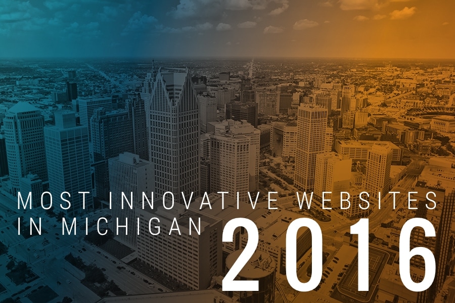
The practice of great web design marches ever forward. As our digital agency looks at ways to improve online marketing for our clients, we often like looking around at what other Michigan business websites are doing.
Last year, we put together a list of great innovative Michigan websites. We thought we’d revisit that theme, looking for even more innovative designs. Like last year, when we talk about innovation, we’re not just worried about prettiness or information architecture design.
We’re interested in what’s new and surprising, yet natural. Something that adds to user experience or design functionality. Just like last year, this year’s 7 innovative website picks all belong to businesses headquartered in the Great Lake State.
- Busch’s
“Mitten born and raised,” Busch’s Fresh Food Market carries on the tradition of neighborhood grocers from its headquarters in Ann Arbor. The business, now in its 41st year, features 15 stores across the region.
The biggest rule in typography is not to have too many competing typefaces. Busch’s homepage breaks this rule handily, yet the resulting web feels rustic and lively, not disjointed. The hand-lettering designs that are coming back in style feature prominently throughout the site. I also love the Michigan touches — such as the Mitten and Upper Peninsula replacing the “O” in “Local Growing Home” and the plant stalk subbing for the “W” in “My Way” on interior pages.
- Steelcase
The largest furniture manufacturer in the world, with offices or factories on six continents, Steelcase was founded in Grand Rapids in 1912. Now focusing on office, education, health, and retail sectors for furniture, technology, and architectural products, the company needs a website that suits many different audiences.
The Steelcase website design manages all these audience journeys perfectly. Uninitiated visitors get up to speed quickly with a beautiful splash image of an industrial office environment featuring several of the company’s most popular products. Clicking on any of the primary menu items listed just above the splash image reveals a well-thought-out hierarchy of corporate pages, research, and customer-focused content.
- Bissell
Headquartered just outside of Grand Rapids in Walker, Michigan, Bissell has been in the floor care business since Ulysses S. Grant was President. Long after its founding 140 years ago in 1876, Bissell has now captured 20% of the vacuum cleaner and floor care market in North America.
I love their design because it’s another great example of how to overlay several customer journeys in one screen. Unlike Steelcase’s hierarchical menus, Bissell does this with color, specifically a rich red, a light green, and a Caribbean blue. Each color accent is used in near equal measure between CTA buttons and menu items, product imagery, and the company logo. The placement of these elements draws the eye back and forth across the main part of the screen, pulling users out of the typical “F” shape pattern websites are viewed in.
- Heritage Guitar
When Gibson Guitar packed up its Kalamazoo factory in 1984 and moved operations to Nashville, many workers didn’t want to go. So some stayed behind and formed Heritage, a boutique shop of instrument makers that take pride in handcrafted precision electric guitars.
For music fans and those who just love American craftsmanship, the Heritage Guitar website is Heaven. The site loads with a full-screen video loop showing the workshop process. Attention to historic typography also goes a long way toward connecting the 30-year-old company to its 19th century roots. The site is also smartly responsive, displaying beautifully on desktop, tablet, or mobile.
- Kalitta Air
Based out of Ypsilanti, Michigan, cargo airline Kalitta Air got its start in 1967 when Conrad Kalitta began transporting car parts in his twin-engine Cessna 310. His American International Airways merged with a Texas cargo airline before being rescued and reformed as the current Kalitta Air, offering scheduled international and ad-hoc cargo charter services for private businesses and the government.
Kalitta’s website is a great example of a corporate business page that isn’t overly complicated. The site is built on the easy-to-use Squarespace platform. Scrolling down the page, strong copy answers the question “Why Kalitta” while further down a company overview video introduces the company and its capabilities to prospective customers.
- Planterra Conservatory
Based out of West Bloomfield, Planterra’s interior landscaping and plant rental services has been around since 1973. The company’s Conservatory, a glass-enclosed botanical garden event venue, opened in 2010. Original greenhouses date from the 1930s and the botanical garden’s building was imported from Izegem, Belgium.
The website looks fine in its desktop version, but really stands out on mobile. This is another responsive design, and in fact seems to be a mobile-first design. This makes sense, given that many of the Conservatory’s clientele are likely wedding customers shopping for venue on their smartphones. The mobile site does an especially good job of organizing lookbook galleries, a blog, and booking and rental services and juggling between corporate and wedding clientele.
- Two Men and a Truck
Founded in 1985, Lansing-based Two Men and a Truck is the largest franchised moving company in the U.S., with international locations in Canada, Ireland, and the U.K. The company still uses the original stick-figure logo drawn by Mary Ellen Sheets when her sons first started the moving business.
The company’s website is a great study in focus. Like many businesses, Two Men and a Truck serves both business clients and consumer clients, sells retail product, and has international footprints to worry about. However, the site focuses on directing all visitors into a lead generation funnel with a CTA that promises to find the nearest franchise location and offer a quote. Hovering over menu items does offer more options, but it’s that initial focus that so well executed and so hard to find in business websites.
Well, that’s it for this edition of our innovative Michigan websites roundup. I’m sure I missed some great examples. Let us know your favorites either on this list or elsewhere on the web.
Are you considering a Michigan business considering a website redesign? Call us at 313-338-9515 or email hello@kaleidico.com to learn how our full-service digital agency can help.