Web design today is defined less by visual trends and more by clarity, performance, and intent. Michigan web design refers to the way Michigan-based businesses design websites that prioritize clarity, performance, and user intent, often in competitive, established industries where trust and usability matter more than novelty.
The websites that stand out aren’t chasing novelty or piling on features—they’re making disciplined decisions about how users move, what they see first, and how quickly they can take action.
That distinction matters. Too often, “innovative” web design is mistaken for flash or experimentation, when in reality, the most effective sites are calm, focused, and easy to use.
This article looks at Michigan web design through that lens. It’s not a directory of agencies or a roundup of trendy layouts. It’s an evaluation of quality—what strong design choices look like in practice, and why they work.
Ready to turn your website into a lead-generating asset—not just a digital brochure? Tell us about your project.
Why Michigan’s economy reinforces restraint-focused web design
Michigan’s economy isn’t defined by flash and trends; it’s built on deep industry leadership, measured growth, and scalable performance.
The state remains a national leader in automotive and advanced manufacturing, reflecting a tradition of long-term investment, workforce training, and operational credibility that supports a sustainable competitive advantage.
This economic backbone influences how Michigan companies think about their digital presence: they favor clarity over gimmicks, function over form, and design decisions that support trust, reliability, and measurable outcomes, values that also show up in effective Michigan web design.
What “innovative” means in Michigan web design in 2026
“Innovative” web design isn’t about doing something new for the sake of originality. In Michigan web design, innovation shows up in how intentionally a site solves real business problems—clearly, efficiently, and without getting in the user’s way.
That’s an important distinction. Many websites look modern on the surface, but struggle where it matters most:
- Guiding users
- Loading quickly
- Supporting meaningful action
The strongest sites apply modern web design standards in ways that feel almost invisible to the user, even though they’re carefully engineered behind the scenes.
At a practical level, innovative Michigan web design is driven by a few core principles.
Innovation starts with user intent
Every page should answer a simple question: why someone is here and what they need next.
Strong design prioritizes user goals over internal preferences, structuring content and navigation around how people actually think and behave—not how an organization is structured.
Performance is part of the design
Speed, responsiveness, and stability directly shape user trust and engagement.
Sites that feel fast and predictable are perceived as more credible—regardless of industry.
Accessibility is non-negotiable
Modern web design standards assume accessibility from the start.
Clear typography, logical hierarchy, sufficient contrast, and keyboard-friendly navigation broaden reach and improve usability for everyone.
Conversion clarity matters more than creativity
Innovative sites make it obvious what action to take next. Whether that’s buying, exploring, signing up, or getting in touch, the path forward is visible without being aggressive or distracting.
Taken together, these principles form the baseline for evaluating Michigan web design today. Innovation is about making smarter decisions that respect users’ time, attention, and needs.
Four Michigan web design examples worth studying
Web design inspiration alone isn’t very useful without context. The sites below serve as reference points for how different Michigan-based brands apply modern web design principles in practical, effective ways.
Each example highlights a specific strength: clarity at scale, disciplined storytelling, experience-driven structure, or utility-first execution.
Together, they show that strong Michigan web design isn’t defined by a single style—it’s defined by smart decisions.
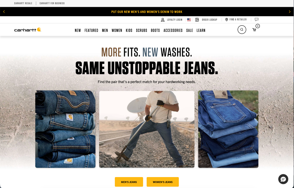
Carhartt — evolving a heritage brand without losing clarity
Carhartt proves that legacy doesn’t have to mean stagnation. With a massive product catalog and a deeply established brand identity, the site still maintains a clear, usable structure that prioritizes discovery and action.
From a design standpoint, the visual hierarchy does most of the heavy lifting. Product categories are easy to scan, navigation remains predictable, and brand elements reinforce credibility without overwhelming the interface.
Key takeaway: Innovation doesn’t require reinvention. Incremental improvements—applied consistently—can modernize a site without sacrificing what made the brand successful in the first place.
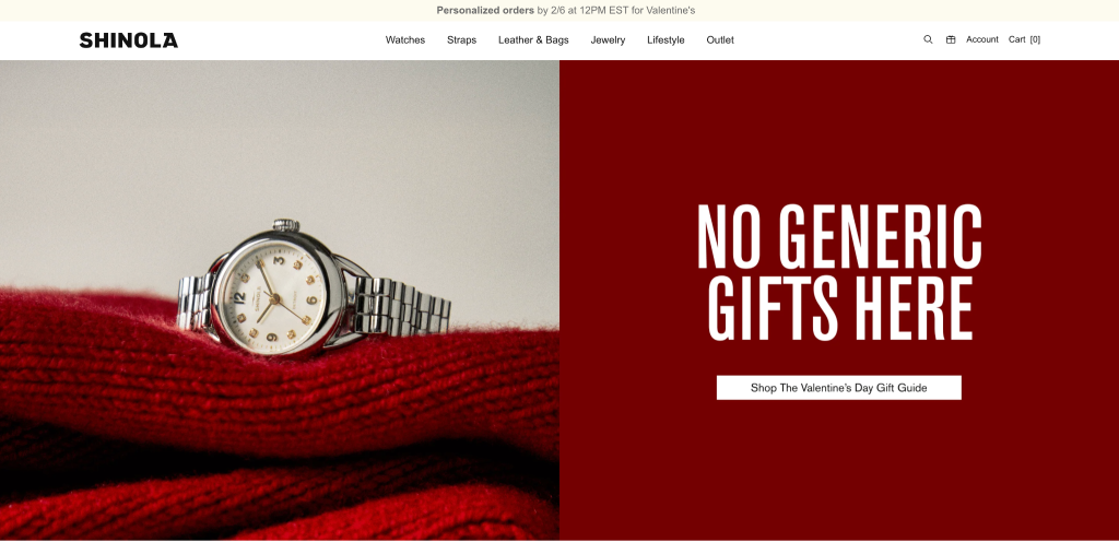
Shinola — premium storytelling that supports conversion
Shinola’s website demonstrates how premium storytelling can coexist with strong conversion design.
The experience is editorial in tone, but never vague in purpose. Whitespace, pacing, and typography create breathing room, while calls to action remain clear and intentional.
What stands out is restraint. Rather than layering interactions or visual effects, the design relies on the content and product to drive the experience. Visitors are guided through the brand narrative without losing sight of the next step.
Key takeaway: Storytelling is most effective when it helps users decide. When narrative supports clarity instead of competing with it, both brand and performance benefit.
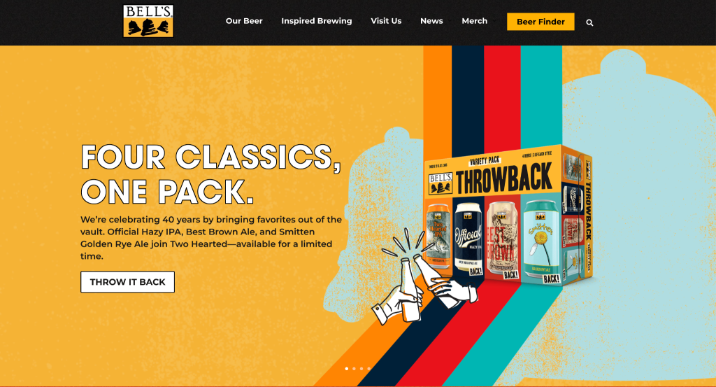
Bell’s Brewery — experience-driven Michigan web design
Bell’s is a strong example of experience-driven Michigan web design because the homepage is unapologetically focused. Rather than competing for attention, the design centers on a single message, a clear visual story, and an obvious next step.
Brand personality is unmistakable, but it’s expressed through illustration, color, and layout—not unnecessary interaction or visual overload.
Key takeaway: You don’t need flashy interactions to create a memorable experience. Clear hierarchy and confident brand expression do more work than visual tricks.
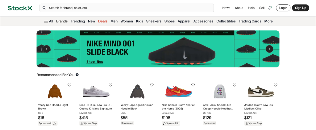
StockX — utility-first design at scale
StockX represents a different side of modern web design: intentional density built for speed and trust. The homepage prioritizes search, pricing, and product discovery, presenting a high volume of information directly to users with minimal friction.
Rather than aiming for visual calm, the design embraces complexity and manages it through familiar patterns. Navigation is extensive but predictable, product cards show the details that matter most, and trust signals—pricing history, sponsorship labels, and authenticity cues—remain visible throughout the experience.
Key takeaway: Good web design doesn’t always feel minimal. When usability and trust are priorities, managing complexity is more important than reducing it.
What strong Michigan web design gets right
Across industries and business sizes, the most effective Michigan web design shares a common foundation. These sites succeed not because they look different, but because they make disciplined, user-first decisions.
Strong Michigan web design consistently:
- Centers on user intent, making it immediately clear who the site is for and what to do next
- Prioritizes performance and reliability, reinforcing trust through fast load times and predictable behavior
- Uses hierarchy over decoration, guiding attention instead of competing for it
- Balances brand expression with usability, ensuring style never obscures function
- Respects user time, removing friction from navigation, discovery, and conversion
Key takeaway: The best Michigan web design isn’t defined by trends; it’s defined by clarity, restraint, and decisions that support real business goals.
What these Michigan web design examples have in common
At first glance, Carhartt, Shinola, Bell’s, and StockX don’t look alike—and that’s the point.
Strong Michigan web design isn’t defined by a single aesthetic or industry. It’s defined by a shared set of decisions that prioritize usefulness, clarity, and intent over surface-level trends.
Across all four examples, a few consistent patterns emerge.
Clear primary actions
Each site makes it obvious what users should do next. Whether that’s shopping, exploring a collection, finding a product, or searching inventory, the primary action is never buried or competing with secondary goals.
This clarity reduces friction and keeps users moving forward instead of hesitating.
Strong visual hierarchy
Effective Michigan web design relies on hierarchy more than decoration.
Headlines, imagery, navigation, and calls to action are intentionally ordered to guide attention rather than compete for it.
Even in dense environments, users can quickly understand what matters most on the page.
Purpose-driven layouts
None of these sites’ design pages is just to “look good.” Layout decisions are tied directly to user intent—how people browse, compare, or decide.
Content is structured around real behaviors, not internal org charts or arbitrary page templates.
Minimal unnecessary UI
Minimal doesn’t always mean sparse, but it does mean intentional.
Each interface avoids features, interactions, or visual elements that don’t serve a clear purpose. When complexity is required, it’s managed—not disguised or ignored.
Respect for user time
Perhaps most importantly, these sites respect how little patience users have.
Pages load with a clear focus, information is easy to scan, and users aren’t forced to work harder than necessary to accomplish basic tasks. That respect shows up in everything from navigation choices to content density.
Taken together, these patterns form a reliable benchmark for evaluating Michigan web design today.
What to prioritize in your next Michigan web design project
Successful web design projects are guided by a short list of priorities that keep the site focused, usable, and scalable:
- Start with user intent, not layout: Define what users need to accomplish and what action matters most before design begins. Structure follows intent—not the other way around.
- Design mobile-first by default: Prioritizing mobile forces clarity, simplifies hierarchy, and ensures the experience works where most users actually interact with your site.
- Measure success beyond aesthetics: A redesign should be evaluated by performance metrics—engagement, conversion paths, and usability—not just whether it “looks better.”
- Build for scalability, not trends: Flexible layouts and modular systems age better than trend-driven designs, making future updates easier and more cost-effective.
These priorities align closely with how modern web design services approach website redesigns today: less emphasis on surface-level polish, more focus on long-term performance and adaptability.
Michigan web design works best when it’s intentional
The strongest examples of Michigan web design succeed because every design decision is made with purpose, what users need, what actions matter most, and how the experience supports those goals without distraction.
Innovation, in this context, is restraint. When design is treated as decision-making, not decoration, websites become easier to use, easier to scale, and far more effective.
Let Kaleidico help you build a site that actually performs in your industry:
If you’re ready to turn your website into a growth-focused asset instead of a digital brochure, tell us about your project.
FAQs: Michigan web design
Many Michigan-based businesses operate in competitive, mature industries, which puts greater emphasis on usability, credibility, and long-term scalability rather than novelty alone.
In modern Michigan web design, innovation isn’t about visual experimentation for its own sake. It’s about making intentional decisions that improve user experience—clear navigation, fast load times, accessible layouts, and obvious next steps that support real business goals.
If users struggle to understand what you do, pages load slowly, mobile experiences feel cramped, or the site looks polished but doesn’t convert, those are strong signals.
Mobile-first design is critical. Designing for smaller screens first forces better prioritization, clearer hierarchy, and more focused content.
Since a majority of users now interact with websites on mobile devices, Michigan web design that isn’t mobile-first often underperforms.
Clarity, speed, accessibility, and scalability should always come before trends. Websites built around flexible systems and clear user intent tend to age better and require fewer costly redesigns over time.