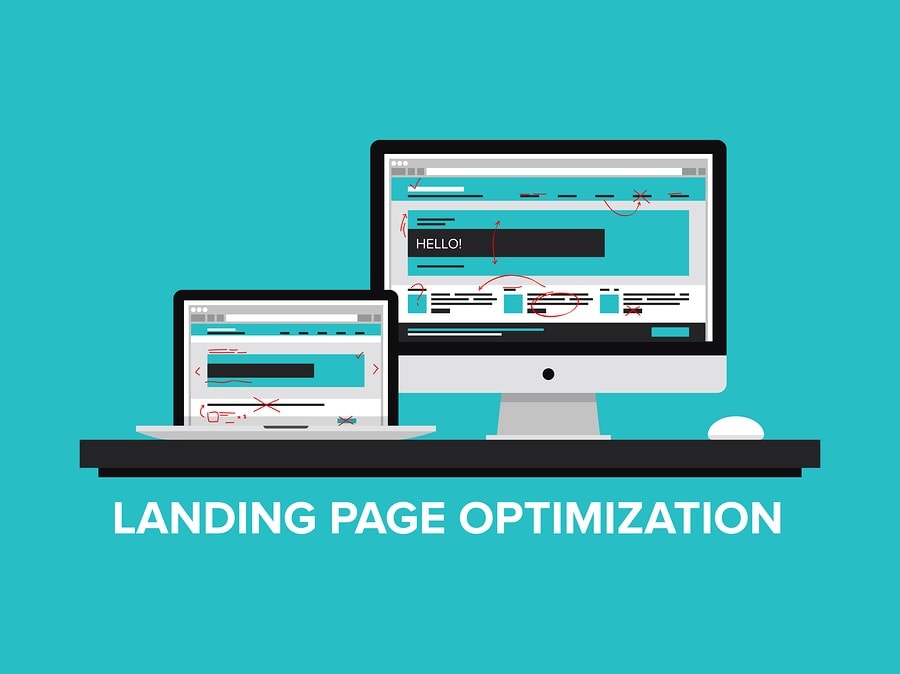
If you have a business and are just starting out, you most likely know how important it is to have a solid UX website when it comes to your landing page. In case you haven’t heard the term yet, it stands for user experience and is all about providing your customers with the highest design quality and usability, so that they will be happy enough to continue interacting with what you have to offer.
However, not every business owner has all the resources he or she needs at the beginning, so it can be pretty difficult to make sure every single aspect of your landing page is in order. This is why we have decided to help out.
Things to keep in mind if you want to create a solid UX website for your startup or landing page:
Make sure the viewers can’t get distracted
This is a must. You might have heard something similar, but a lot of startups often have a subjective point of view when it comes to what constitutes a distraction and what doesn’t.
The easiest way to tell what is and what isn’t a distraction is to put yourself in your customers’ shoes. For example, what would you find distracting on a landing page you were redirected to it after clicking on an ad?
After all, the main idea of a solid UX website is to get the visitors to convert. You need to push them further down the sales funnel.
And you can’t do that if they start getting distracted by random animations or pictures on the landing page that only serve an aesthetic role. It’s better to have none and just cut to the chase.
At most, if you really want a picture, then set it as a background and make sure it’s a photo of someone who is smiling since it gives viewers a sense of familiarity and comfort.
Also, you may not want to place the landing page on your website, as it might cause the viewers to wander away. Giving them the option to explore might seem like the right choice, but it can really work to your disadvantage in this case.
Remember that a solid UX website doesn’t feature too many CTAs
A lot of startups make the mistake of trying to include way too many CTAs on their landing page. Trust us when we say that this isn’t going to do you any favors. It’s better just to make separate landing pages for each CTA.
Sure, it might be more work, but at least you won’t scare off potential leads.
Why would viewers leave? Because they have too many options, so they don’t know what action to take. It might sound like you’re treating your audience like children, but it’s far from that. It’s just that the attention span people have today and their busy lifestyles don’t really allow them to take in all the options you offer.
Thus, they don’t have the time to actually process what they would stand to gain by clicking, so they start feeling anxious and just decide to look somewhere else. Somewhere they won’t have to spend too much time thinking the offer over before they click on the CTA.
So make sure you stick to a single CTA on your landing page if you want to have a website that converts visitors into potential future clients.
Need further assistance? We have the solutions you need!
We know how tough it can be to start out in the business world, so this is why we are more than happy to help out all startup owners. Thanks to our experience, we are able to offer you reliable information about marketing and growing your business in general.
If you’re willing to go that extra mile and sign up for our newsletter, you will get immediate access to vital information that can benefit your business.
As for landing pages, we offer quality web developments services that aim to offer results, as well as lead generation services that help ease your audience further down the funnel.
