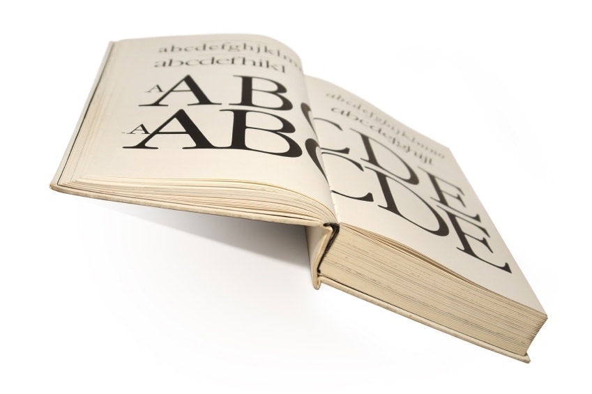
I say I love good typography, but more often it’s that I hate bad typography. And that’s how it’s supposed to work. You don’t notice the leaf, you just admire the tree.
Responsive design works much the same way. When it’s good, you enjoy the content. You learn something, laugh, follow, subscribe, click for more.
When the mobile experience doesn’t work, you can’t enjoy the content. Instead, you’re pinching and zooming, trying out portrait — then landscape, squinting to read, trying to close that oversized popup window.
Making Content That’s Consumable
In the last few years, the brand narrative has become an essential part of marketing any web-based business. Content is still king. Customers want more information — about the industry, your product or service, its development, and the company that makes it — before they become your buyers or subscribers.
You’ve realized this fact and embrace it. You’ve put significant time and resources into developing an ongoing content strategy that delivers value to your site visitors and boosts your SEO. And you’re satisfied with your investment until you pull out your phone.
Responsive Containers for Your Content
The easiest way to think about responsive design might be to imagine the invisible containers framing all your content, from the header to your post image, post copy, sidebar, and so on. The containers may shift from several columns on your desktop to a single column on your phone as specified breakpoints. The containers can also scale up or down in size in relative values (2 to 1, 4 to 1, a percentage of the screen width, etc.), rather than specific dimensions.
This becomes incredibly important for the readability of your content. The variety of screens a customer could be viewing your content on are too numerous to count.
Most of the time, everything works together rather well on responsive templates. Content columns shift position seamlessly and images and buttons scale down to manageable sizes for your mobile devices. Designers have taken great care to make sure these elements look their best on any screen. But surprisingly, text can sometimes still get overlooked.
Scaling Type for Mobile
Take a look at these two screencaps from the mobile sites of the Chicago Tribune and the Guardian.

Both sites are mobile friendly, and it would certainly be possible to read this news item on both. However, look at the size difference between the H1-level title and the body copy in the Tribune example. The article headline is 3 to 4 times as large as the body. This probably gives a sense of authority and prestige to the copy on the desktop site, but it feels too large on a smaller screen.
Now look at the Guardian’s attention to typographic scale. The headline is slightly smaller and the bulleted fact points below are significantly larger in size. The Guardian’s photo caption copy is the size of the Tribune’s body copy.

Scrolling down, you can see that the Guardian’s body copy is the size of its bullet points — and much larger and more readable than the Tribune’s body copy.
It’s a small detail, but one that makes the Guardian’s content much easier to consume. Now, imagine, it’s not a news item the mobile user has decided to read, but your conversion page, where the balance of power is tipped more in the customer’s favor. Responsive typography suddenly seems much more important.
Other Responsive Typography Elements to Keep In Mind
While a larger-sized body copy is perhaps the most important change you can make to improve your web design, tweaks to other elements can also make a difference.
Cameron Chapman points out the importance of resizeable type “that not only resizes to the size of the screen, but that is also resizeable by the user.” In our news site examples, the Guardian earned another point for having this feature.
A larger typeface obviously means a shorter number of characters per line. Finding the optimal line length for mobile phone or tablet screens can also be a challenge. Jason Pamental has a great discussion of this problem at Typecast. While 40–50 characters may work for some tablet screens or print newspaper columns, 35–40 works better for narrow phone screens.
Our examples bear out this fact, as well. One of the Guardian’s longer body copy lines comes in at 40 characters:

while the Tribune’s longest copy line comes in at 46 characters:

While only 6 characters, the difference is around 13% shorter. That’s enough of a difference to be noticeable on a small screen. (And yes, this makes our final Guardian–Tribune face-off 3–0, for those keeping score.)
Lastly, if your site has more personality in its type, say with large script or block-letter headlines, you could also specify an alternate typeface to better fit on the mobile user’s screen. This can come into play when the desktop typeface uses wider characters or character spacing. While not applicable to our news site examples, you might need to consider alternate typefaces for your mobile users if this problem is affecting your site.
Further Reading
As complex as moving and resizing content for hundreds of device types may sound, the fix isn’t that complicated. These posts by Cameron Chapman and Val Head answer your “how to” questions for implementing these changes to your HTML and CSS, while Jason Pamental goes into more detail about the aesthetics behind the code. If you’re still wrapping your head around the concept of responsive design, Fast Co’s John Brownlee sorts that out in a series of helpful GIFs.
Your Content Deserves to Look Its Best
If you’re not happy with what you currently see on your phone, or, if you’re building a new site, talk to your designer to make sure responsive typography is a part of your mobile-ready design.
Your content is one of the most important elements of your website and your business. When a potential customer surfs to your conversion page, you don’t want them to be thinking about your site design or typeface. You want them to read your content and see the value your business can offer them. To make that value stand out, your content deserves to look its best.
Like this article? Join us every week for actionable ideas. Insights from real campaigns, straight to your inbox.
[mc4wp_form id=”7464″]