What's in this article?
If your website is due for an update, it can pay to get ahead of the pack with the latest design trends. Fresh web designs can take advantage of visual elements that are popular with web users as well as incorporate cutting edge functionality to give your site an advantage over your competitors.
What visual elements and functionality are a must for your next redesign? Take a look at our list of seven must-haves for your 2015 redesign.
Sticky Website Elements
A header, a menu, a call to action, a sidebar, social sharing buttons, a footer. No, I’m not just naming the anatomy of a website, I’m talking about one of the most important features available on modern business websites. Any of these page elements can be made “sticky” — that is, remaining visible on the screen no matter what part of the page your user is viewing.
On modern websites, we scroll. Whether it’s because the design is a one-page storyboarded concept or because your market research and SEO expert recommend in-depth blog posts, most users are scrolling through your web content.
Why It’s a Must: If each element is confined to its home area of the page, it’s gone once the user has scrolled past. In other words: out of sight, out of mind. That value-rich call to action or easy Facebook share could be lost elsewhere on the page.
With sticky web design elements, you can specify what flows off the screen as a user scrolls and what stays put. This lets sidebars and menus beckon for users to spend more time on your site consuming your content. Calls to action are visible whenever a new user determines s/he wants to sign up for more value. Social sharing icons are visible along the left of your best blog post, ready to help your users share the piece across the web.
Custom Visuals
Stock photos aren’t all bad, but poor imagery can be just as bad as no imagery. There’s great stock photography out there of course, but poorly chosen stock images stick out, and not in a good way. Custom visuals are becoming the norm as more people have access to high-definition cameras and made-to-order illustrations and logos are only a click away on Fiverr or Elance.
Why It’s a Must: Custom visuals can help with branding and increase engagement. Personality and narrative are important parts of a modern website. Custom visuals help you tell your story and infuse your new site design a personality that’s as engaging as it is true to your brand.

Much care went into the design of Moz’s cartoon mascot Roger.
Some brands go with illustrations while others go with photography. The SEO and analytics company Moz debuted Roger, their cartoon robot mascot in 2009. The illustration helped establish a visual voice and champion for the brand and built momentum and recognition for the company name as it became established in the digital marketing analytics space.

The founders of Chubbies Shorts, seen here before the company was formed, have a long history with irreverent marketing imagery.
Going a totally different direction, the mens apparel company Chubbies uses cheeky, Instagram-style lifestyle photography to promote its brand image. A good portion of content is user-generated snaps by fans of the irreverent shorts brand, but the rest is in-house creative. All of which has garnered some impressive results. As one recent profile noted, “They’re more like a Y-Gen media company that happens to sell shorts.”
Video
It’s said that 2014 was the year of video for the web. Facebook, Vine, and Instagram helped propel social media video to new heights of content consumption. Website design is beginning to take advantage of the same power to communicate and engage users.
Why It’s a Must: The new so-called infinite looping videos allow you to give your users an immersive, wide-screen multimedia experience. Applications are pretty wide open, too. Karma, a portable wifi startup, uses video to demonstrate product application while helping target users identify with the brand. Digital Telepathy, a UX shop, uses video to promote several brand features, of note, their office culture.

Bluecore’s fun product video is “below the fold” on the front page.
Even more traditional video design elements have the power to make a huge impression on your web design. A trigger marketing tech startup, Bluecore uses a witty and whimsical front-page video pitch to connect with prospects in a way that’s entertaining and accessible, even for less tech-savvy decision makers.
Flat Design
Simplicity seems to be a trend much of web design is moving towards. Flat design is part of this shift. Color gradients, pattern textures, drop shadows, and other features that give texture and a three-dimensional feel to a website have given way to a more streamlined approach.
In flat design, white space increases, buttons make stronger visual statements, and typography is less whimsical and more consumable. While that may lead you to believe that flat-design sites are boring or cold, quite the opposite is true.
Why It’s a Must: These subdued backgrounds let your content shine in the spotlight. Whether a blog post, a full-screen looping video, large image, or conversion page, your content is front and center in this design aesthetic.
Responsive Web Design
We’re over a month past Google’s Mobile Friendliness ranking algorithm update, dubbed Mobilegeddon in some circles. The world hasn’t ended and not everyone has noticed a rankings change, as yet, but rest assured, mobile is the future.
Yet there are so many mobile devices, each with different screen sizes, your next site redesign really needs to be responsive in order to be competitive. Responsive websites adjust automatically to fit text, images, menus, and even links to the screen of each device, whether it’s an iPhone, a tablet, or a desktop PC.
Why It’s a Must: Responsive web design is the best practices web design solution for a market that’s flooded with literally hundreds of different device sizes. With Google’s latest update, search rankings can be impacted by site features that aren’t mobile-friendly. Smaller brands actually have an advantage here. An agile website can more easily be updated than a large corporate site, giving your mid-sized brand an edge over much larger competitors.
Large Images
It’s no surprise then that as the possibilities of web design have multiplied and broadband speeds have increased, imagery has become supersized. For today’s websites, large header images, known as hero images, are common. These can be used with overlaid type or standalone. Beyond the header, similar visuals are found throughout many site designs.
Adding even more visual interest, parallax features can give a sense of motion to your design visuals. Parallax scrolling entails different elements on the page scrolling at different rates, usually giving a sense of depth with the picture seeming to move behind neighboring content. Parallax zoom or pan features can make an image seem to zoom or pan ever so slightly, either with a mouse-over or through a looping animation.
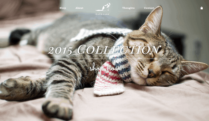
More hero image examples like CatScarf can be found in Line25’s roundup.
Why It’s a Must: On the web, a picture is still worth a thousand words. Take a look at CatScarf. If you weren’t quite sure if that is what it sounds like, the site imagery confirms in a second that is indeed scarves for cats.
The truth is, we web users are all visual creatures. Photographs, graphics, and designs help us process more information faster. A great visual can help users personally connect with your brand, pique their interest to learn more, or make your copy more memorable.
Typography
Even though it may not be the first thing your users notice, typography matters. It’s not just what you say, but how you say it. Your typographic design choices can affect how your users feel about your content.
Why It’s a Must: Readability, responsiveness, and design pairings can affect how your users feel about your content. Technical issues such as browser compatibility can also affect the user experience — if your design choices aren’t compatible with the user’s system, they won’t experience your brand or content as intended.
Modern web typography goes hand in hand with flat design, large imagery, and responsive web design. Easily consumable body copy compliments any flat-design site. And incorporating type that’s responsive for mobile devices makes a huge difference for continued content consumption by your users.
Large imagery also makes a great compliment to your typography. Of note, hero images paired with bold typography are frequently used to make a big impression in headers and calls to action.
If you’re looking for something beyond the default web-safe fonts available a few years ago, prepare to be pleasantly surprised. Google’s own web fonts have grown to an impressive array of nearly 700 font families, universally compatible with all current browsers. With such a large collection of typography options, your web design can take on almost any typographical aesthetic.
Conclusion
If your site is do for a redesign, don’t neglect the visual and functional trends that can make it all worthwhile. Big, custom imagery, video, and typography can make your brand and messaging connect with more website visitors, increasing your engagement and your bottom line. Responsive design, sticky elements, and flat design can help showcase the content on your site, making it more easily consumable for all your visitors.
Are you in the midst of a redesign? What’s on your must-have list? What current trends are you in love with? Let us know in the comments or contact us!