
What's in this article?
All right, let’s get straight to the point—your website likely needs a makeover since the last time it’s been redesigned.
Whether you work for a law firm, mortgage lender, and senior living community, you want to make sure you have the best website for your visitors, right?
Well, at Kaleidico, we’re here to help you do just that.
We’ve compiled an extensive list of the most common website design mistakes that are turning away your visitors before they can fill out your contact forms.
Skip ahead: Schedule a free discovery call with our team.
Website design and layout mistakes
A website’s design and layout serve as the first impression for your visitors, whether they’re looking for a senior living community or a person in need of a mortgage lender.
Just like a cluttered office or a poorly-kept law firm might discourage clients, an overcrowded, inconsistent, or unresponsive website design can turn visitors away before they even fully understand what you offer.
A well-organized, pleasing, and unique layout invites users to explore more, increasing their likelihood to convert into clients.
1. Lack of mobile-responsive design
Websites should be optimized for all devices. If your site isn’t mobile-friendly, you’ll lose a significant portion of potential clients who use their phones or tablets to find services.
- Law Firms: A mobile-responsive site is critical for clients who need urgent legal aid and are searching on the go.
- Mortgage Lenders: Potential borrowers might want to check rates or calculate loans using calculators on their devices. A poor mobile experience can lead them to competitors.
- Senior Living Communities: Family members often search for information on their mobiles, so a responsive design is essential.
2. Poor navigation
User-friendly navigation is key for retaining visitors.
If people can’t find what they’re looking for quickly, they’re likely to leave, which is known as a “bounce” rate. Currently, the average bounce rate across industries is 41%-55%, meaning half of your visitors are leaving without reading content or filling out forms.
- Law Firms: If practice areas or contact details are hard to find, potential clients may feel frustrated and abandon the site.
- Mortgage Lenders: Complex mortgage terminology is challenging enough. Make it easier by ensuring easy navigation to information on rates, loan types, and calculators.
- Senior Living Communities: Visitors need quick access to services, facilities, and contact information.
3. Overcrowded homepage
The homepage should have a clean and organized layout, avoiding excessive elements that overwhelm visitors and make it difficult to find essential information.
- Law Firms: The law firm website’s homepage is cluttered with an excessive number of text blocks, images, and buttons, leading to confusion and a lack of focus on key services.
- Mortgage Lenders: The mortgage website’s homepage displays an overwhelming amount of mortgage options, rates, and calculators, making it challenging for visitors to find the specific information they need.
- Senior Living Communities: The senior living community’s homepage is filled with too many elements, such as event announcements, testimonials, and facility highlights, making it hard for visitors to navigate and find relevant details.
4. Cluttered layout and design
Websites should have a clean and organized layout, avoiding excessive elements and visual clutter that overwhelm visitors and distract from the main content.
- Law Firms: The law firm’s website is filled with numerous sidebars, banners, and excessive widgets, making it difficult for potential clients to focus on the core information or call to action.
- Mortgage Lenders: The mortgage lender’s website displays an overwhelming amount of text, graphics, and promotional offers on the homepage, causing visitors to feel overwhelmed and unable to find specific details about loan options.
- Senior Living Communities: The senior living community’s website has an overcrowded layout with excessive pop-ups, chat boxes, and floating buttons, creating a chaotic browsing experience for visitors.
5. Using a template that looks like everyone else’s
Websites should have a unique design that reflects the company’s brand and sets it apart from competitors.
- Law Firms: The law firm website uses a generic website template that is commonly seen among other law firms, lacking originality and failing to make a distinctive impression on potential clients.
Read: The Comprehensive Guide to Law Firm Web Design in 2023 - Mortgage Lenders: The mortgage lender website’s design closely resembles that of other mortgage companies, resulting in a lack of differentiation and failing to highlight the company’s unique selling points.
Read: The Best Mortgage Websites of 2023 and Why - Senior Living Communities: The senior living community website uses a template that is similar to many other senior living communities, making it challenging for visitors to distinguish the community’s unique features and offerings.
6. Having an inconsistent theme or design
Websites should maintain consistency in design elements, color schemes, and branding throughout all pages to create a cohesive and professional impression.
- Law Firms: The law firm website features inconsistent design elements, with different pages utilizing various color schemes, fonts, and layouts, resulting in a disjointed user experience.
- Mortgage Lenders: The mortgage lender website lacks consistency in branding, with different sections using different logo variations and color palettes, diluting the company’s identity.
- Senior Living Communities: The senior living community website exhibits inconsistency in design elements, such as using different fonts and styles across various pages, compromising the overall visual appeal and brand consistency.
7. Bad color choices and contrasts
Color schemes should be visually pleasing and ensure proper contrast between background and text to enhance readability and accessibility.
- Law Firms: The law firm website features a color scheme with low contrast between the background and text, making it difficult for visitors with visual impairments to read the content.
- Mortgage Lenders: The mortgage lender website uses bright and clashing colors for important call-to-action buttons, distracting visitors and diminishing the effectiveness of the buttons.
- Senior Living Communities: The senior living community website has a color scheme with poor contrast between text and background, leading to readability issues for older adults or individuals with vision difficulties.
8. Having too much or too little white space
Proper use of white space (or negative space) is essential for a balanced and visually appealing website design.
- Law Firms: The law firm website lacks sufficient white space, with text, images, and other elements placed too closely together, resulting in a cluttered and overwhelming appearance.
- Mortgage Lenders: The mortgage lender website has excessive white space, leaving large gaps between content sections and making it challenging for visitors to identify the relationships between different elements.
- Senior Living Communities: The senior living community website fails to utilize white space effectively, cramming text, images, and buttons together, making it difficult for visitors to focus and digest the information.
Schedule a Discovery Session
Learn how to attract new leads and clients.
Content and SEO mistakes
Content and SEO are like the compass guiding your visitors—and Google—through your site. They work together to make your website discoverable and understandable.
A site without quality content and SEO is akin to a law firm that doesn’t advertise its services, a mortgage lender that uses complex jargon, or a senior living community that doesn’t update its services.
You’ll be invisible to those who need you most, buried in the back pages of search engine results.
9. Too much industry jargon
Use simple, accessible language written at an eighth-grade reading level.
Avoid using complex industry terminology that may confuse or alienate website visitors who are not familiar with the specific language.
- Law Firms: The law firm website is filled with legal jargon and technical terms that the average client may struggle to understand, hindering effective communication and discouraging potential clients, e.g. “force majeure” or “plea in abeyance.”
- Mortgage Lenders: The mortgage lender website overwhelms visitors with financial jargon and technical terms related to lending and interest rates, making it challenging for borrowers to grasp key information.
- Senior Living Communities: The senior living community website uses industry-specific terminology and acronyms that may be unfamiliar to individuals exploring senior living options, resulting in confusion and difficulty in decision-making.
10. Poor use of images and videos
Don’t just use images or videos to fill out space. Make sure they serve a purpose.
Images and videos should enhance the website’s content and convey the desired message effectively, rather than being irrelevant, low-quality, or distracting.
- Law Firms: The law firm website includes generic stock photos unrelated to the legal field, diminishing credibility and failing to resonate with potential clients.
- Mortgage Lenders: The mortgage lender website uses low-resolution images of houses and borrowers that appear blurry and unprofessional, discouraging trust in the company.
- Senior Living Communities: The senior living community website lacks images of actual residents and activities, making it difficult for visitors to visualize the living experience and community atmosphere.
11. Weak, boring, and non-descriptive headlines
Avoid generic headlines that your readers will unintentionally ignore.
Headlines should be attention-grabbing, concise, and clearly convey the main message or value proposition of the website or specific sections.
- Law Firms: The law firm website’s headlines lack impact and fail to highlight the firm’s unique strengths or the benefits clients can expect, resulting in a missed opportunity to capture visitors’ attention, e.g. “Experienced Legal Services.”
- Mortgage Lenders: The mortgage lender website’s headlines are generic and fail to communicate the key advantages of choosing their lending services, leading to a lack of interest from potential borrowers, e.g. “Quality Mortgage Solutions.”
- Senior Living Communities: The senior living community website’s headlines are vague and do not effectively convey the unique features and benefits of their senior living options, making it challenging for visitors to understand the community’s value proposition, e.g. “A Welcoming Community for Seniors.”
12. Generic ‘About Us’ page
Little known fact: your ‘About Us’ page is a great page to optimize for better search results.
The ‘About Us’ page should showcase the company’s unique story, values, and team to build trust and establish a connection with visitors.
- Law Firms: The law firm website’s ‘About Us’ page provides generic information about the firm’s history without highlighting the expertise, accomplishments, or personal stories of the attorneys, missing an opportunity to build rapport with potential clients.
- Mortgage Lenders: The mortgage lender website’s ‘About Us’ page offers limited information about the company’s values and team, failing to establish a personal connection and differentiate from competitors.
- Senior Living Communities: The senior living community website’s ‘About Us’ page lacks details about the founders, staff, and community philosophy, making it difficult for potential residents and their families to develop trust and familiarity.
13. Inadequate ‘Services’ or ‘Products’ description
Clearly and concisely explain the services or products offered, highlighting the unique features, benefits, and value they provide.
- Law Firms: The law firm website’s ‘Services’ page only provides a general overview of practice areas without diving into specific services offered, resulting in a lack of clarity for potential clients.
- Mortgage Lenders: The mortgage lender website’s ‘Products’ page fails to provide detailed information about the various loan programs, rates, and special offerings, leaving borrowers unsure about the specific products available.
- Senior Living Communities: This website’s ‘Services’ page needs comprehensive descriptions of the different levels of care, amenities, and activities offered, making it challenging for potential residents and their families to understand the full range of services provided.
14. Not publishing blogs in a very, very long time
When was the last time you published a blog? 2017? That’s not good.
Regularly updating website content with fresh and relevant information is vital to engage visitors, maintain search engine visibility, and establish credibility.
- Law Firms: The law firm website’s blog section hasn’t been updated in years, giving the impression that the firm is not active or up-to-date with the latest legal developments.
- Mortgage Lenders: The mortgage lender website’s resources section only contains outdated articles and guides, making visitors question the company’s expertise and reliability.
- Senior Living Communities: The senior living community website’s news section lacks recent updates or announcements, giving the impression that the community is stagnant or not actively engaging with residents and their families.
15. Not having enough content on your website to keep readers
Does your website have enough content to keep people on it?
The website should provide enough information to address visitors’ questions, concerns, and needs, ensuring they have a comprehensive understanding of the services or offerings.
- Law Firms: The law firm website’s content is sparse and lacks in-depth explanations of legal processes, rights, and potential outcomes, leaving potential clients seeking more detailed information elsewhere.
- Mortgage Lenders: The mortgage lender website provides limited information about loan programs, eligibility requirements, and the application process, leaving borrowers uncertain and hesitant to take the next steps.
- Senior Living Communities: The senior living community website lacks comprehensive details about amenities, activities, and care services, making it difficult for families to assess whether it meets their loved one’s specific needs.
16. No blogs or poorly written blogs
Blogs are often the primary driver of traffic and leads to your website (through Google searches). If you’re not blogging, you’re missing out on a TON of traffic—for free.
Blog articles provide an opportunity to showcase expertise, engage visitors, and improve search engine rankings, but they should be regularly updated and well-written.
- Law Firms: The law firm website lacks a blog section altogether, missing out on the chance to share legal insights, answer common questions, and attract potential clients searching for legal information.
- Mortgage Lenders: The mortgage lender’s blog contains outdated posts with spelling and grammatical errors, undermining the company’s professionalism and expertise in the mortgage industry.
- Senior Living Communities: The senior living community’s blog hasn’t been updated in years, suggesting a lack of ongoing engagement and failing to provide valuable information for families researching senior living options.
17. Neglecting the best SEO practices
The first person to read your website’s content isn’t a person—it’s a Google bot. So if you’re not organizing your content correctly, Google will never show it in a search result.
Implementing search engine optimization (SEO) techniques is required to ensure the website ranks well in search engine results and attracts organic traffic.
- Law Firms: The law firm website lacks optimized title tags and meta descriptions, resulting in poor visibility on search engine result pages and reduced organic traffic.
Read: The Comprehensive Guide to Law Firm SEO Strategy in 2023. - Mortgage Lenders: The mortgage lender website fails to utilize targeted keywords throughout its content, making it difficult for search engines to understand the site’s relevance to specific queries.
- Senior Living Communities: The senior living community website lacks proper header tags and keyword optimization, causing it to rank poorly in searches related to senior living options.
18. Ignoring mobile-first indexing
Did you know that Google now prioritizes mobile-friendly websites first in their search results?
With the prevalence of mobile browsing, websites should prioritize mobile optimization to ensure a seamless experience for mobile users.
- Law Firms: The website does not prioritize mobile optimization, resulting in a poor user experience for visitors accessing the site from smartphones or tablets.
- Mortgage Lenders: The mortgage website is not optimized for mobile devices, leading to slow loading times, distorted layouts, and difficulty in accessing key information on smaller screens.
- Senior Living Communities: The senior living website does not provide a mobile-responsive design, making it challenging for mobile users to navigate the site and access important details about the community.
19. Not linking to other pages on your website (internal linking)
Once a reader is on your website, keep them on your website longer by linking to other web pages throughout your content and blog posts.
Internal linking helps improve website navigation, boosts SEO, and enhances user experience by guiding visitors to related or relevant content.
- Law Firms: Lack of internal links between related practice area pages, hindering users’ ability to explore and find comprehensive information about specific legal services.
- Mortgage Lenders: The mortgage lender website does not utilize internal linking to guide visitors to additional resources or informative content related to specific mortgage programs or processes.
- Senior Living Communities: The senior living website fails to include internal links between pages that highlight amenities, services, and activities, making it challenging for visitors to access relevant information and explore the community’s offerings.
20. Ignoring page titles and meta descriptions
Meta descriptions are a brief preview or synopsis of your website shown in a Google search. Make sure you write them to entice people to click on your website.
Page titles and meta descriptions are basically required for search engine optimization and help users understand the content of a web page before clicking on it.
- Law Firms: The law firm website has generic page titles and meta descriptions that fail to accurately describe the specific legal services offered on each page, resulting in reduced visibility and click-through rates in search engine results.
- Mortgage Lenders: The mortgage lender website neglects to optimize page titles and meta descriptions, missing the opportunity to attract potential borrowers by effectively communicating the content and benefits of each page.
- Senior Living Communities: The senior living community website lacks well-crafted page titles and meta descriptions, making it difficult for search engine users to understand the unique features and offerings of each page.
21. Not keeping up with design trends
Does your website still look like Craigslist circa 1995?
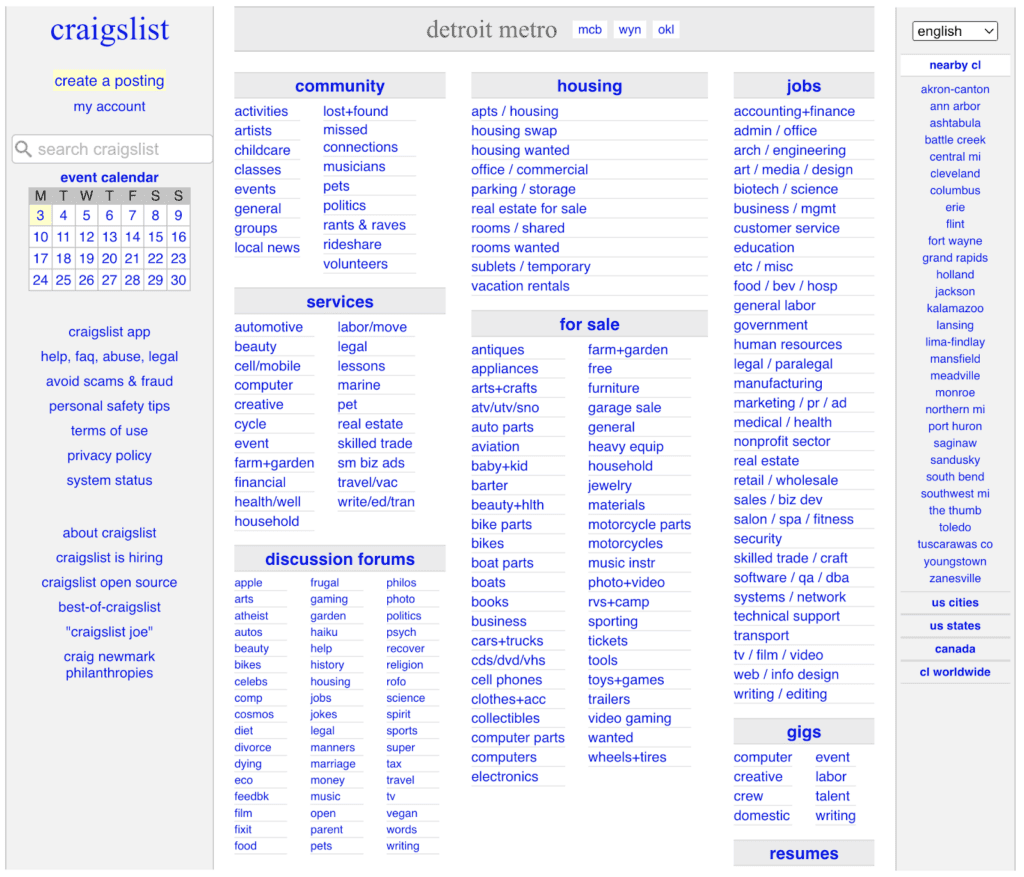
Websites should stay current with modern design trends to ensure a visually appealing and user-friendly experience.
- Law Firms: The law firm website utilizes outdated design elements, such as excessive gradients and flash animations, making it look unprofessional and out of touch with contemporary design standards.
- Mortgage Lenders: The mortgage lender website features a cluttered layout with excessive drop shadows and outdated color schemes, giving it a dated and unappealing appearance.
- Senior Living Communities: The senior living website uses an old-fashioned design with small fonts and busy backgrounds, making it difficult for older adults to read and navigate.
22. Not optimizing for local search
Are you listing all of the cities you work in on your website? If not, how will people in those cities find you?
Local businesses, such as law firms, mortgage lenders, and senior living communities, should optimize their websites to appear prominently in local search results.
- Law Firms: The law firm website lacks local keyword optimization, making it difficult for potential clients to find the firm when searching for legal services specific to their geographical location.
- Mortgage Lenders: The mortgage lender website does not include location-specific keywords or localized content, resulting in reduced visibility in local searches for mortgage services.
- Senior Living Communities: The senior living community website does not target local keywords or provide localized information, making it challenging for individuals searching for senior living options in a specific area to find the community.
Discuss updating your web design in a free call with Kaleidico.
User experience (UX) mistakes
Imagine visiting a mortgage lender’s office where you’re bombarded with loud, unwelcome music, or trying to navigate a confusing senior living community with no clear directions.
Unpleasant, isn’t it?
The user experience on your website should be seamless, intuitive, and pleasant.
Ensure that your site is quick to load, free of annoying pop-ups or auto-playing media, and easy to navigate. It can be the difference between a lead staying on your site or leaving for a competitor.
23. Slow loading speed
Does your website take more than three seconds to load? Too slow, 53% of your mobile visitors of your visitors have already left your page.
Slow websites frustrate users and can impact SEO negatively.
- Law Firms: A slow site can create a perception of inefficiency, something that law firms can’t afford.
- Mortgage Lenders: Potential borrowers are likely comparing rates and terms across multiple lenders. They won’t wait for a slow site to load.
- Senior Living Communities: Slow speeds can deter busy family members looking for quick information.
24. Bad use of pop-ups
Everybody hates pop-ups, but sometimes they can serve valuable purposes such as providing a contact form.
Pop-ups can be intrusive and annoying if not used strategically, detracting from the user experience and potentially driving visitors away.
- Law Firms: The law firm website bombards visitors with multiple pop-ups asking for newsletter sign-ups, which distracts them from accessing important information.
- Mortgage Lenders: The mortgage lender website displays a pop-up ad immediately upon entering, obstructing users from viewing the main content and causing frustration.
- Senior Living Communities: The senior living community website overwhelms visitors with intrusive pop-ups promoting special offers, hindering their ability to explore the site freely.
25. Unintuitive user interface
“How the heck did I get on this page?”
Websites should have a clear and intuitive interface that allows visitors to navigate easily and find the desired information without confusion or frustration.
- Law Firms: The law firm website has a complex navigation menu with obscure labels, making it challenging for potential clients to find specific practice areas or contact information.
- Mortgage Lenders: The mortgage lender website’s loan application process is convoluted, requiring visitors to click through multiple pages and fill out unnecessary fields, resulting in a high abandonment rate.
Senior Living Communities: The senior living website lacks a prominent and easily accessible menu to navigate between different pages, causing visitors to struggle in finding specific information about amenities, pricing, and availability.
Schedule a Discovery Session
Learn how to attract new leads and clients.
26. Autoplaying media
“Wow! That was loud and annoying!”
Autoplaying videos or audio can be intrusive and disruptive to the user experience, especially if it plays automatically with sound.
- Law Firms: The law firm website features a video that starts playing automatically as soon as visitors land on the page, interrupting their browsing experience and potentially distracting them from important information.
- Mortgage Lenders: The mortgage lender website has an auto-playing audio clip that plays a sales pitch immediately upon loading, causing annoyance and discouraging visitors from staying on the site.
- Senior Living Communities: The senior living community website includes a video that starts playing automatically, overpowering the visitor’s browsing experience and making it difficult to focus on other content.
27. Failing to test on different browsers or devices
“The site isn’t loading on Chrome, try Firefox to see if it works.”
Websites should be tested across various browsers, devices, and screen sizes to ensure consistent functionality and optimal user experience.
- Law Firms: The law firm website is not compatible with certain web browsers, leading to broken layouts, distorted images, or features that do not work properly.
- Mortgage Lenders: The mortgage lender website is not mobile-responsive, causing it to appear distorted and difficult to navigate on smartphones and tablets.
- Senior Living Communities: The senior living community website does not adapt well to different screen sizes, resulting in content that is cut off or difficult to read on smaller devices.
28. Forgetting to incorporate a search function
“Can’t I just search for what I’m looking for??”
Including a search function on the website allows visitors to quickly find specific content or information they are looking for.
- Law Firms: The law firm website does not have a search bar, making it time-consuming and frustrating for visitors to locate specific legal articles, case studies, or other relevant information.
- Mortgage Lenders: The mortgage lender website lacks a search function, causing visitors to spend more time navigating through different pages to find specific loan information or resources.
- Senior Living Communities: The senior living community website does not include a search bar, making it difficult for visitors to locate specific information about amenities, pricing, or available services.
29. Using ugly, inappropriate, or hard-to-read fonts


Unless you’re running a kindergarten or a spa, don’t use Comic Sans or Papyrus fonts unless you want to be ridiculed.
Fonts should be legible, visually appealing, and appropriate for the website’s content and target audience.
- Law Firms: The law firm website uses a decorative font for its main body text, making it difficult for visitors to read and comprehend the legal information presented.
- Mortgage Lenders: The mortgage lender website employs a small and condensed font for important loan details and terms, causing readability issues for borrowers and potential customers.
- Senior Living Communities: The senior living community website utilizes a cursive font that is challenging to read, particularly for older adults or those with visual impairments.
Credibility and trust mistakes
Trust and credibility are essential in any business.
This is particularly true for law firms handling sensitive cases, mortgage lenders dealing with major financial transactions, and senior living communities taking care of loved ones.
In the digital world, this translates to clear contact information, updated privacy policies, and secure websites. Failing to provide these can lead to mistrust, making visitors less likely to engage with your services.
30. Inadequate contact information
“This company doesn’t have a phone number or address listed. They seem shady.”
Contact details, including phone numbers, email addresses, and physical addresses, should be easily accessible and prominently displayed on the website.
- Law Firms: The law firm website hides its contact information in a small corner of the page, making it difficult for potential clients to quickly get in touch.
- Mortgage Lenders: The mortgage lender website lacks a clear and visible contact page, leaving visitors uncertain about how to reach out for inquiries or assistance.
- Senior Living Communities: The senior living website fails to include a phone number or email address on the homepage, making it challenging for interested parties to inquire about services.
31. Ignoring customer testimonials and reviews
“This website seems questionable. Where’s the reviews?”
Including testimonials and reviews from satisfied clients or customers helps build trust and credibility.
- Law Firms: The law firm website lacks a dedicated section for client testimonials, missing an opportunity to showcase positive experiences and build confidence in potential clients.
- Mortgage Lenders: The mortgage website does not display customer reviews or testimonials, leaving potential borrowers uncertain about the company’s reputation and the quality of its services.
- Senior Living Communities: The senior living website fails to include testimonials from residents and their families, making it challenging for visitors to gauge the satisfaction level and experiences of current residents.
32. Inadequate site security
“Google told me this website was unprotected. I’d rather not visit it.”
Websites should prioritize security measures, including SSL certificates and data encryption, to protect user information and build trust.
- Law Firms: The law firm website lacks an SSL certificate, leading to a “Not Secure” warning in web browsers and potentially deterring potential clients from submitting sensitive information.
- Mortgage Lenders: The mortgage website does not have secure encryption for the loan application process, making visitors wary of sharing their personal and financial details.
- Senior Living Communities: The senior living website doesn’t display trust seals or security certifications, raising concerns about the safety of residents’ personal information.
33. Missing privacy policy or terms and conditions
Are you not displaying a privacy policy or terms and conditions? If not, you may be opening yourself to potential liabilities and headaches.
Websites should include a privacy policy and terms and conditions to inform visitors about data collection practices, user rights, and legal agreements.
- Law Firms: The law firm website does not have a visible privacy policy or terms and conditions page, raising concerns about how client data is handled and potentially violating legal requirements.
Read: Ethical Regulations in Legal Marketing - Mortgage Lenders: The mortgage website lacks a clear privacy policy, leaving visitors uncertain about how their personal information will be used and protected.
- Senior Living Communities: The senior living website does not provide a terms and conditions page, failing to establish clear guidelines for residents and their families and potentially leading to misunderstandings.
34. No or poor social proof (testimonials, reviews, case studies)
If your company is making big claims about what you’re able to achieve, then you better have some case studies or testimonials to back it up.
Including social proof, such as testimonials, reviews, or case studies, helps build trust and credibility by showcasing positive experiences and successful outcomes.
- Law Firms: The law firm website lacks client testimonials or case studies that highlight successful legal outcomes and positive client experiences, missing an opportunity to build credibility and trust with potential clients.
- Mortgage Lenders: The mortgage website does not prominently feature customer reviews or success stories, leaving visitors uncertain about the experience and reliability of the company’s loan services.
- Senior Living Communities: The senior living website fails to showcase resident testimonials or success stories, making it challenging for potential residents and their families to assess the quality of care and overall satisfaction within the community.
35. Failing to update the copyright year in the footer
Websites should regularly update the copyright year in the footer to demonstrate that the content is current and the website is actively maintained.
- Law Firms: The law firm website displays an outdated copyright year in the footer, giving the impression that the site and its content are no longer relevant or up to date.
- Mortgage Lenders: The mortgage website continues to display a previous year’s copyright in the footer, undermining visitors’ confidence in the company’s attention to detail and commitment to staying current.
- Senior Living Communities: The senior living community fails to update the copyright year, creating doubt about the freshness and relevance of the community’s information and services.
Schedule a free discovery call with our team to avoid these mistakes.
Lead generation and conversion mistakes
Converting a visitor to a client is like asking someone to trust you with their personal injury case, their home mortgage, or their loved one’s care.
Without clear calls-to-action, the absence of value propositions, or failure to use optimized landing pages, you’re basically hoping they’ll make the leap on their own.
Guiding your visitors and making it easy for them to become clients is as important online as it is in a physical office.
36. No clear call-to-action (CTA)
“Good information. I got what I needed.”
(Leaves the website without filling out a form.)
Websites should have clear and compelling calls to action (CTA) that guide visitors to take specific actions, such as contacting the firm, requesting a quote, or signing up for a newsletter.
- Law Firms: The law firm website lacks a prominent “Schedule a Free Consultation” button, making it difficult for potential clients to take the next step.
- Mortgage Lenders: The mortgage lender fails to include a clear CTA for visitors to start the loan application process, resulting in missed conversion opportunities.
- Senior Living Communities: The senior living community doesn’t have a noticeable CTA for interested individuals to request a tour online or receive more information, leading to a loss of potential residents.
37. Failing to capture leads
Want to generate leads? Make forms accesible!
Websites should include lead capture forms or contact options to collect visitor information and follow up with potential customers.
- Law Firms: The law firm website lacks a prominent contact form or clear instructions for potential clients to request a consultation or provide their contact information for follow-up.
- Mortgage Lenders: The mortgage lender website doesn’t have a lead capture form for visitors interested in getting more information about loan programs or starting the application process.
- Senior Living Communities: The senior living community website fails to provide a way for visitors to request brochures, schedule tours, or provide their contact details for further assistance.
38. Lack of a clear value proposition or “mission statement”
In big, bolded words, put exactly what your company does at the very top of the website (Morgage Lender for First Time Homebuyers), so your reader will think “Yep, this must be the place for me.”
Websites should clearly communicate the unique value and benefits that the company or organization offers to its target audience.
- Law Firms: The law firm website fails to articulate its unique value proposition, making it challenging for potential clients to understand what sets the firm apart from its competitors and why they should choose it.
- Mortgage Lenders: The mortgage website lacks a clear value proposition, leaving visitors uncertain about the advantages of choosing the company for their mortgage needs compared to other lenders.
- Senior Living Communities: The senior living website does not clearly communicate its unique value proposition, making it difficult for potential residents and their families to understand the distinct benefits and advantages of choosing the community over others.
39. Failing to use landing pages for campaigns
A landing page is typically the web page you’re sent to after clicking on a Google Ad. It’s like the “sales page” that’s been designed to collect form submissions.
Landing pages specifically designed for marketing campaigns allow for targeted messaging, lead capture, and better conversion rates.
- Law Firms: The law firm website does not utilize landing pages for specific marketing campaigns, missing an opportunity to deliver tailored messages, capture leads, and track campaign effectiveness.
- Mortgage Lenders: The mortgage lender website lacks dedicated landing pages for targeted marketing campaigns, hindering the ability to provide customized messaging and track campaign performance accurately.
- Senior Living Communities: The senior living community website does not leverage landing pages for marketing campaigns, resulting in missed opportunities to deliver personalized messaging, capture leads, and monitor campaign success.
40. Ignoring A/B testing
“When we turned the ‘Contact Us’ button blue, people clicked on it more than when it was a red button.”
A/B testing involves comparing different versions of a web page to determine which one performs better and optimizes conversions.
- Law Firms: The law firm website neglects A/B testing, missing out on valuable insights to optimize elements such as headlines, call-to-action buttons, or page layouts for improved conversion rates.
- Mortgage Lenders: The mortgage lender website fails to conduct A/B testing, limiting the ability to identify and implement changes that could lead to higher conversion rates for loan applications or other desired actions.
- Senior Living Communities: The senior living community website does not engage in A/B testing, resulting in a missed opportunity to optimize the site’s elements, content, and design to increase conversions and engagement.
41. No favicon

Look at your browser tab. See that purple “K” in the tab indicating you’re on Kaleidico’s website? That’s a favicon. Without it, your website will just have a sad, gray square that’s unbranded.
A favicon is a small icon that appears next to the website’s title in the browser tab and enhances branding and recognition.
- Law Firms: The law firm website lacks a favicon, which can make it challenging for visitors to quickly identify and locate the website among multiple open tabs.
- Mortgage Lenders: The mortgage lender website does not include a favicon, making it more difficult for visitors to recognize and return to the site in their browsing history or bookmarks.
- Senior Living Communities: The senior living community website is missing a favicon, potentially causing confusion and making it harder for visitors to identify the site when switching between tabs or bookmarks.
42. Missing social media integration
Did you forget to put links to your company’s Facebook, Instagram, or LinkedIn page? Missed opportunity.
Websites should include social media buttons or links to allow visitors to connect with the company’s social media profiles and share content easily.
- Law Firms: The law firm website does not display any social media icons or links, missing an opportunity to engage with potential clients and share valuable legal information through social channels.
- Mortgage Lenders: The mortgage lender website lacks social media integration, preventing visitors from easily accessing the company’s social media pages or sharing informative mortgage content with their networks.
- Senior Living Communities: The senior living community website fails to provide links to its social media accounts, making it difficult for visitors to explore the community’s social media presence and engage with its content.
Technical issues and accessibility mistakes
A website that doesn’t work well or excludes people based on their abilities is like a law firm with a broken front door, a senior living community with no handicap access, or a mortgage lender that fails to cater to non-English speakers.
Ensuring your website is technically sound, free of broken links, and accessible to all users is not only ethical but also increases your potential client base, allowing you to reach and help more people.
43. Broken links

“Oh no! Looks like this page is broken. 404 error.”
Broken links lead to error pages or non-existent content, frustrating visitors and potentially damaging the website’s credibility.
- Law Firms: The law firm website contains numerous broken links, resulting in error messages when users attempt to access important resources, such as legal articles or case studies.
- Mortgage Lenders: The mortgage lender website’s mortgage calculator page has broken links, preventing visitors from utilizing the tool and potentially causing them to seek out competitors’ calculators instead.
- Senior Living Communities: The senior living community website’s events calendar features broken links, making it impossible for visitors to register for upcoming events or activities.
44. Inaccessible for people with disabilities
“I can’t read this website because of its colors. What were the designers thinking?”
Websites should be designed with accessibility in mind, ensuring that people with disabilities can easily navigate and access the content.
- Law Firms: The law firm website does not provide alternative text for images or proper heading structure, hindering users with visual impairments or screen readers from understanding the content.
- Mortgage Lenders: The mortgage lender website lacks sufficient color contrast and keyboard navigation options, making it difficult for visitors with visual impairments or motor disabilities to interact with the site.
- Senior Living Communities: The senior living community website fails to offer text resizing options or clear navigation for individuals with low vision, limiting their ability to explore the site and access helpful information.
45. Overuse of dynamic web pages
“Oh hey, it’s a giant screen animation. That’s cool,” said no one ever.
Dynamic web pages with excessive animations or constantly changing content can be distracting and negatively impact the user experience.
- Law Firms: The law firm website features numerous animated elements, transitions, and scrolling effects that make it difficult for visitors to focus on the content or navigate the site smoothly.
- Mortgage Lenders: The mortgage lender website uses excessive dynamic elements, such as rotating banners and auto-scrolling testimonials, which can be overwhelming and hinder visitors from easily accessing important information.
- Senior Living Communities: The senior living community website incorporates excessive animations and transitions, causing distractions and making it difficult for visitors to find specific details about services, amenities, and care options.
46. Using low-quality stock photos
“Why did they choose to use this picture on their website? It’s so terrible!”
High-quality, relevant images help establish trust and enhance the visual appeal of the website, while low-quality or generic stock photos can detract from the overall user experience.
- Law Firms: The law firm website uses low-resolution stock photos that appear pixelated and unprofessional, diminishing the credibility and trustworthiness of the firm.
- Mortgage Lenders: The mortgage lender website features generic stock images of happy families and houses that are commonly seen on other mortgage websites, lacking originality and failing to make a unique impression.
- Senior Living Communities: The senior living community website relies on stock photos of seniors that do not accurately represent the community’s residents, making it challenging for visitors to connect with the real-life experience.
47. Failing to use analytics to track user behaviors
“Oops, I forgot to set up tracking, so I’m not sure which of our web pages is actually generating the most traffic.”
Tracking website performance through analytics tools is essential for understanding visitor behavior, identifying areas for improvement, and optimizing conversions.
- Law Firms: The law firm website lacks analytics tracking, preventing the company from gaining insights into which pages are most visited, how visitors navigate the site, and which channels bring the most leads.
- Mortgage Lenders: The mortgage lender website does not integrate any analytics tools, making it impossible to measure the effectiveness of marketing campaigns or understand user engagement.
- Senior Living Communities: The senior living community website fails to utilize analytics, missing out on valuable data that can help identify popular content and improve the overall user experience.
48. Ignoring conversion rate optimization (CRO)
“How well are our pages converting visitors into new leads?”
“I’m not sure.”
Optimizing the website’s design, content, and user experience to increase the conversion rate is crucial for turning visitors into leads or customers.
- Law Firms: The law firm website lacks clear conversion funnels, resulting in missed opportunities to guide potential clients towards desired actions, such as requesting a consultation.
- Mortgage Lenders: The mortgage lender website does not utilize persuasive copywriting or compelling visuals to encourage visitors to complete a loan application or contact the company.
- Senior Living Communities: The senior living community website overlooks the importance of strong calls-to-action and persuasive content, leading to a lower conversion rate for potential residents.
Hire Kaleidico to design your website
Ready to turn your website from a digital maze to a well-paved path?
At Kaleidico, we don’t just build websites, we build digital experiences, specializing in law firm marketing, mortgage marketing, and senior living marketing.
From design and development, SEO, and content marketing, to PPC ads and lead generation, we’ve got you covered. Don’t navigate the digital landscape alone, let us be your guide.
Schedule a Discovery Session today and let’s create something amazing together.